
A lead generation form is often the final step between interest and conversion. When it works well, users move through it naturally and complete it without hesitation.
When it works poorly, they pause for a moment, lose momentum and leave.
That small drop in flow is all it takes for a qualified lead to disappear.
Most teams do not realise the form is the problem.
The offer is strong and the user has intent, yet something in the form slows them down.
Maybe it asks for too much information. Maybe it loads slowly. Maybe it simply feels unclear.
These small friction points break the user’s pace and turn an interested visitor into an abandoned session.
The best lead capture forms do the opposite. They feel light, predictable and safe.
They match what the user expects to see, guide them through each step and only ask for what is necessary. This is what makes high converting forms work across SaaS trials, real estate lead forms, healthcare intake forms and service inquiries.
This guide walks you through how to build a lead generation form that feels effortless to complete, earns trust from the first field and consistently brings in qualified leads.
Here’s a quick overview of everything we discuss today
- Form Features that make the best lead capture forms
- Limitations and Mistakes to Avoid in high-converting lead generation forms
- Using Compliance Correctly in Lead Generation Forms
What makes the best lead capture forms convert
Strong lead capture forms work because users understand them instantly, move through them without friction, and feel safe sharing their information. The goal is not to collect everything at once. It is to guide users through a smooth path where every field has purpose and every interaction feels intentional.
The principles below break down how to create that experience and how MakeForms strengthens it with the right structure, intelligence, and user focused features.
1. Reduce Friction at Every Step
Friction is the biggest reason users abandon a lead form. Every extra click, unclear label, slow load, or irrelevant question increases resistance. High performing lead capture forms minimize effort and keep users moving in a smooth, predictable flow. When users can complete a form without stopping to think, your completion rates rise naturally.
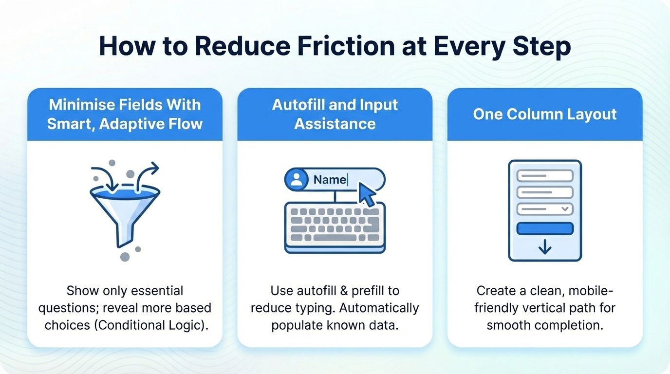
Minimise Fields With Smart, Adaptive Flow - The best lead forms stay lean and ask only for what is necessary. Keeping your lead form short is the fastest way to reduce friction. Start with only the essentials, then reveal additional questions gradually based on what the user selects. This keeps the form light for most visitors while still letting you collect deeper details from users who need advanced options.
MakeForms makes this simple with conditional logic that shows or hides fields, sections or entire steps in real time, so every user moves through a form that feels personalised, short and easy to finish.
Autofill and Input Assistance - Typing slows users down, so if there’s anything you can do to reduce the manual input, it will directly improve completion rates. The best form builders have either an “autofill” or a “prefill” feature which allows you to do exactly this.
Let’s say you’re a real estate broker, a potential buyer wants to inquire about a property on your website. Instead of them having to type out the property details, your form automatically captures the property information from the page and pre-fills it into the inquiry message.
With MakeForms, you can do this very easily. MakeForms can automatically detect standard fields so browsers trigger native autofill instantly. Or you can also pre-populate fields using URL parameters which is especially powerful for property pages, pricing pages or ad landing pages. Here’s a video on how to enable auto-fill on your MakeForms Lead Forms.One Column Layout - A single column layout creates a clean vertical path and keeps the user moving without confusion.
Every MakeForms template is built with a single column, mobile optimised layout by default. Spacing, alignment and field sizing are already configured to support natural eye movement and thumb friendly completion. This ensures even complex forms feel light and easy.
2. Motivate Users With Clear Value, Confident CTAs, and Reassuring Next Steps
Users complete lead generation forms when they instantly understand what they will receive, what happens after they submit, and why the form is worth their time. Clear motivation removes hesitation and keeps the momentum going.
- Show clear, immediate value - Start by placing a short value message in the first place the user looks. This could be a quote, a property detail sheet, a pricing breakdown, or an instant download. When the benefit is obvious, users feel more comfortable moving forward.
- Outcome focused CTAs - The button matters too. Strong action driven CTAs like “Get My Quote” or “See Pricing” help users understand what will happen next.
- Reduce final step anxiety - You can make the decision moment even easier by adding a simple reassurance line below the CTA. Tell users what to expect. A small note like “Your report arrives immediately” or “A specialist will contact you shortly” creates a feeling of safety and avoids last minute drop offs.
MakeForms makes value and action messaging effortless. You can place benefit text anywhere in the form, highlight outcomes using microcopy blocks, and personalise messages through URL parameters. CTA styling is fully customisable and you can test variations without code. You can also add a short reassurance line below the button to make the decision moment feel safe and predictable for every user.
3. Build Trust From the First Field
Users complete lead forms when they feel safe, respected and in control of their data. Trust removes hesitation and makes users more willing to share personal details. A trustworthy form looks clean, communicates clearly and provides visible proof of security. When trust is present, your completion rate increases even if you ask for slightly more information.
- Trust Microcopy - A simple sentence that tells users what will happen with their information, how it will be used and what will not happen. Microcopy reduces anxiety and makes the form feel transparent. It removes the fear of spam or unwanted calls.
- Branding and Visual Quality - Users associate good design with professionalism and reliability. A smooth experience creates trust even before the user reads anything.
- Visible Security Indicators - Security cues reassure users that the form is legitimate and safe to submit. Small icons and statements signal safety. They reduce hesitation especially for forms collecting emails, phone numbers or sensitive data.
MakeForms makes building trust simple and natural. You can add short reassurance lines, consent text and privacy notes anywhere in your form with easy microcopy blocks. If you need region specific compliance like GDPR, TCPA or HIPAA, you can enable them with a single toggle.
Your form can match your brand perfectly. MakeForms lets you customize colours, fonts and spacing without code so everything feels polished and professional.
Every form is protected automatically. SSL, encryption and optional HIPAA secure storage keep user data safe. You can add privacy links or a short note on how the data will be used, so trust is clear right where it matters.
4. Verification and Lead Quality Controls
Verification keeps your lead quality high, but if it is too strict, it slows users down and creates drop offs. The goal is to validate information in a way that guides the user, not blocks them. A high converting lead capture form balances accuracy with ease. Users should feel supported while typing, not corrected after they submit.
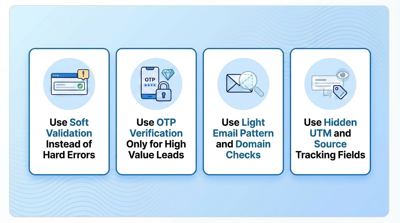
- Use Soft Validation Instead of Hard Errors - When a form blocks progress with rigid error messages, users often abandon it altogether. Soft validation guides the user instead of stopping them, which protects your completion rates without compromising data quality.
MakeForms uses smart inline validation that guides users gently instead of stopping them. It catches small mistakes as they type, offers helpful suggestions, and lets you choose lighter or stricter rules based on the form. Real users keep moving, while obvious errors and bot entries get filtered out. - Use OTP Verification Only for High Value Leads - OTP is powerful for verification but adds friction. It should only appear when absolutely necessary.
For instance, a mortgage pre-qualification form uses OTP because the intent is high. A real estate lead form for brochure downloads does not force OTP.
MakeForms gives you optional OTP on any field with a simple toggle. You can turn it on only where it matters most and keep the rest of the form fast. Since OTP is built in, there is no need for external tools or complicated setup. It is quick to enable and easy for users to complete. - Use Light Email Pattern Checks - Strict validation blocks real leads. Light checks catch obvious mistakes without rejecting users.
MakeForms lets you control how your form checks email formats. You can choose a light pattern check that accepts most real email addresses or switch to stricter rules when you want tighter verification for high intent leads. This flexibility helps you prevent fake or mistyped emails without blocking genuine users. - Use Hidden UTM and Source Tracking Fields - Knowing where leads come from is essential for campaign optimization but asking users directly creates friction and ruins the experience.
MakeForms captures UTMs automatically and stores them in hidden fields so users never have to enter anything manually. The data passes straight to your CRM, email platform or sheets, giving you clean attribution and full campaign visibility without extra configuration. This type of automation is a key part of learning how to automate lead generation, since it removes manual data handling and helps teams respond to leads more efficiently.
5. UX Mechanics That Directly Boost Completion
Great UX keeps the form feeling easy and predictable. When users do not have to guess what comes next or struggle with the layout, they move through the form quickly. These simple mechanics make the experience smoother, especially on mobile where most users convert.
- Eliminate Unnecessary Scrolling - Scrolling makes forms feel longer and increases uncertainty. Users cannot see the finish line, which creates hesitation.
MakeForms automatically keeps your form layout tidy and easy to follow. Field spacing adjusts on its own so every step feels compact and scroll free. You can arrange fields with simple drag and drop, and the form stays clear and consistent even when later steps collect more details. - Show a Progress Indicator for Multi Step Forms - Multi step forms work better because they feel lighter and easier to handle. When users can see where they are in the process, the form feels shorter and less overwhelming.
MakeForms gives you clear progress indicators that keep users moving. You can build multi step forms with simple drag and drop, add step numbers automatically, and preview the full journey in one click. Each step loads instantly and auto saves user input so nothing ever gets lost. This creates a guided, structured experience that helps users finish your form without hesitation. - Mobile First Design - 45% of all web form submissions now come from mobile, which means your lead generation form must be designed to work flawlessly on small screens.
MakeForms is built mobile first. Fields resize automatically, buttons are large and touch friendly, numeric inputs trigger the correct keyboard and spacing stays clean on every device. The form loads quickly even on slower networks so users never wait or pinch zoom. Everything is designed to help mobile visitors complete their submission smoothly. - Clear Visual Flow - A structured layout reduces cognitive load and improves decision making. Users know exactly where to click next.
MakeForms uses a visual grid system that keeps everything neatly aligned. Fields, labels and buttons stay consistent across devices so your form always looks clean and easy to follow without needing a designer. - Fast Load Speed - Speed impacts conversions directly. Delays frustrate users and cause immediate abandonment.
MakeForms runs on an optimised engine that loads fast regardless of traffic. The system is built to stay quick even with logic or OTP enabled, allowing users to begin their form without waiting.
Mistakes to Avoid While Building an Online Lead Generation Form
Even strong forms fail when friction or confusion enters the flow. Avoid these common mistakes to keep users moving smoothly.
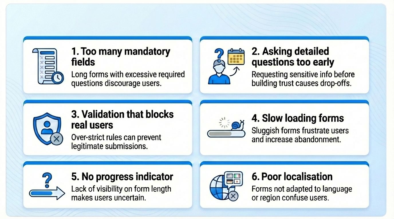
- Too many mandatory fields
Long forms increase effort and create instant drop offs.
Example: An insurance form asking 12 details upfront discourages most users.
Businesses looking for better ways to attract and qualify prospects can benefit from learning
how to generate insurance leads before optimizing their form strategy. - Asking detailed questions too early
Deep qualifiers feel intrusive unless the user already has strong intent.
Example: Asking for budget on a top of funnel ebook download. - Validation that blocks real users
Overly strict rules stop genuine submissions.
Example: Rejecting Gmail on a webinar form or forcing OTP on a simple newsletter signup. - Slow loading forms
Heavy scripts and unoptimised embeds make users leave before the form appears.
Example: A form that takes 4 seconds to load loses mobile users instantly. - No progress indicator
When users cannot see how long the form is, they assume it will take too much time.
Example: A career form with 20 fields and no step counter feels endless. - Poor localisation
Incorrect formats create confusion and reduce trust.
Example: A global audience struggling with a phone field that only accepts US numbers.
Using Compliance Correctly in Lead Generation Forms
Compliance builds trust and protects user data. Use each framework only where appropriate.
HIPAA
- For healthcare teams in the United States.
- Use for patient details, medical history, or appointment data.
GDPR / PIPEDA
- For EU or Canada based users.
- Use when collecting personal identifiers like email, phone, or name.
TCPA
- TCPA governs phone based communication in the United States.
- Use when your follow up includes SMS or phone calls.
- Your form needs clear consent text and an unchecked box.
Example: “By providing your number, you agree to receive a call about your request.”
Why compliance improves completion rates
Compliance is not only a legal requirement. It strengthens trust. Visitors are more likely to submit personal information when they see:
• Clear consent language
• Region specific privacy notices
• A professional and transparent form experience
Good compliance signals that the business respects user data, which directly improves completion and lead quality.
Why MakeForms Gives You an Edge in Lead Form Performance
MakeForms is built to optimize every stage of lead capture, from first click to submission, giving your forms a measurable performance advantage. Here’s how
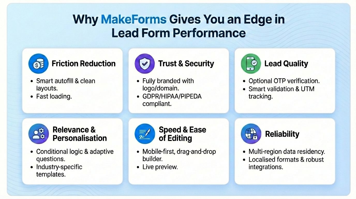
Friction Reduction
- Smart autofill for instant input
- Clean single column layouts
- Fast loading even on low networks
Trust & Security
- Fully branded forms with your logo, colours and domain
- One click GDPR, HIPAA, PIPEDA and TCPA fields
- SSL and encrypted storage enabled automatically
Lead Quality
- Optional email and OTP verification with a simple toggle
- Smart, adjustable validation rules
- Automatic UTM and source tracking in hidden fields
Relevance & Personalisation
- Conditional logic builder for adaptive question flow
- Ready to use templates for SaaS, real estate, healthcare and services
Speed & Ease of Editing
- Mobile first templates with large tap targets
- No code editing and drag and drop builder
- Live desktop and mobile preview while building
Global Fit - Multi region data residency in 10 countries
- Localised phone, date, currency and language formats
Reliability
- Auto save so users never lose progress
- Quiet anti spam filters
- Integrations with HubSpot, Salesforce, Pipedrive, Sheets, Notion, Zapier and webhooks
Strong lead generation forms are the result of clear structure, thoughtful UX, and a friction free flow that respects a user’s time. MakeForms gives you the flexibility, compliance, and smart form technology needed to create these experiences with ease.
Build your highest converting lead form with MakeForms - Start your free trial today!
FAQs
Most forms perform best with 3–5 essential fields. Only ask for information that directly impacts qualification. Move deeper questions to follow-up workflows.