

A high-converting lead capture form should be well-thought-out. A combination of the data you want to collect and the user experience. Every color, field, and word taps into human psychology. Even one use of smart logic or automated pre-fill can make a user feel seen.
Today, we explore how psychology, UX, and smart form design come together to create forms that actually convert.
1. Ease First: Reduce Friction and Cognitive Load
People are naturally drawn to what feels effortless. A form that looks long or confusing can trigger instant drop-offs.
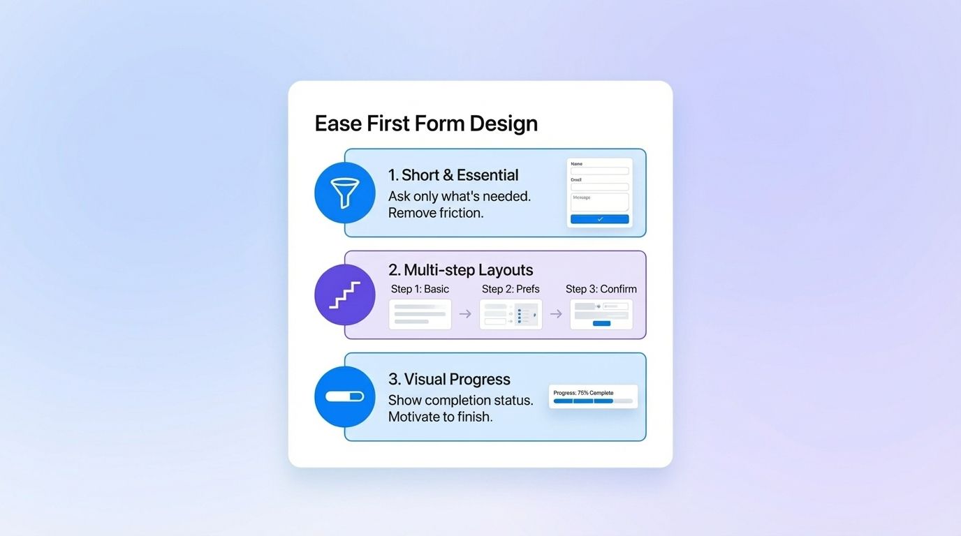
The fix: Keep forms short and structured. Ask only what’s essential and use multi-step or one-at-a-time layouts to make completion feel manageable. And use progress bars to visually show them that they’re almost there!
A long form broken into steps like “Basic Info → Preferences → Confirmation” feels more like progress than a chore.
This approach not only improves completion rates but also taps into the Zeigarnik Effect, once users start something, they’re wired to finish it.
2. The Flow Matters: Field Order and Form Logic
How you arrange your questions matters as much as which ones you ask.
Users subconsciously judge the form’s difficulty by its first few fields. If you start with something heavy — like “Phone Number” or “Company Revenue” — you risk early abandonment.
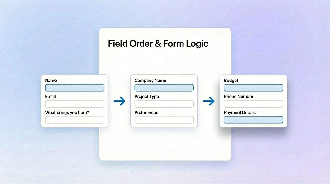
The psychology: People prefer to begin with low-effort, low-commitment questions that feel safe. Once they’re invested, they’re more open to sharing sensitive details.
Best practices for field order:
- Start light: name, email, or a friendly qualifier (“What brings you here today?”)
- Ease into context: company, project, or preferences.
- End with commitment fields: budget, contact info, or payment.
- Group related questions logically, it reduces mental switching.
In tools like MakeForms, you can easily rearrange field order in drag-and-drop view or even automate flow with conditional sequences (which we talk about more below).
3. Personalization: The Science of Relevance
71% of customers now expect personalized interactions (McKinsey). If your lead capture form treats every user the same, it’s already behind.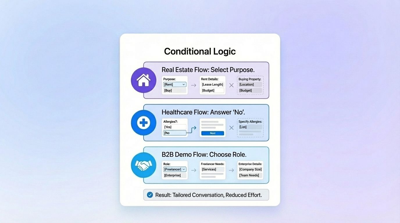
Conditional logic is how you bring personalization into your form flow. Instead of asking everyone the same 10 questions:
- A real estate lead selecting “Looking to Rent” skips all “Buying Property” fields.
- A healthcare form hides allergy questions if the user answers “No.”
- A B2B demo form can show different fields for “Freelancer” vs “Enterprise.”
Using smart logic or conditional logic keeps users engaged and reduces perceived effort, it feels like a conversation tailored to them, not a checklist.
Platforms like MakeForms make this simple through their Logic Builder, where you can visually set rules that adapt to user inputs in real time.
4. Memory and Familiarity: Auto-Fill Known Information
Returning visitors shouldn’t have to start from zero. Auto-fill known details like name or email using stored session data or login info, it’s both a time-saver and a trust builder.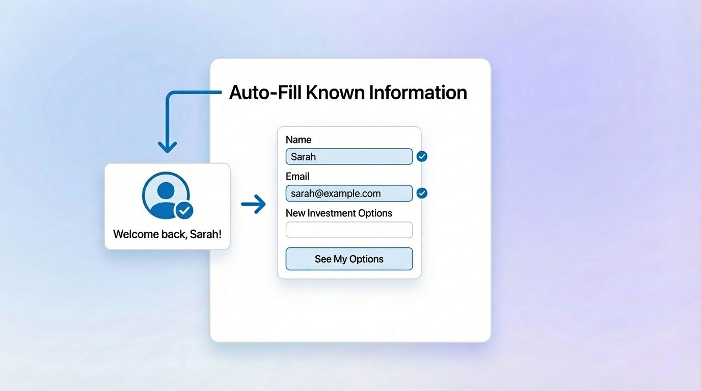
Imagine:
"Welcome back, Sarah! Ready to explore new investment opportunities after your recent market success? Here are some options tailored to your preferences."
That’s not just efficient, it’s actually emotionally intelligent. Pre-fill acknowledges the user’s journey and strengthens their relationship with your brand.
5. Visual Trust: Design, Color, and Flow
Users decide in seconds whether to trust a form. Design psychology plays a major role here:
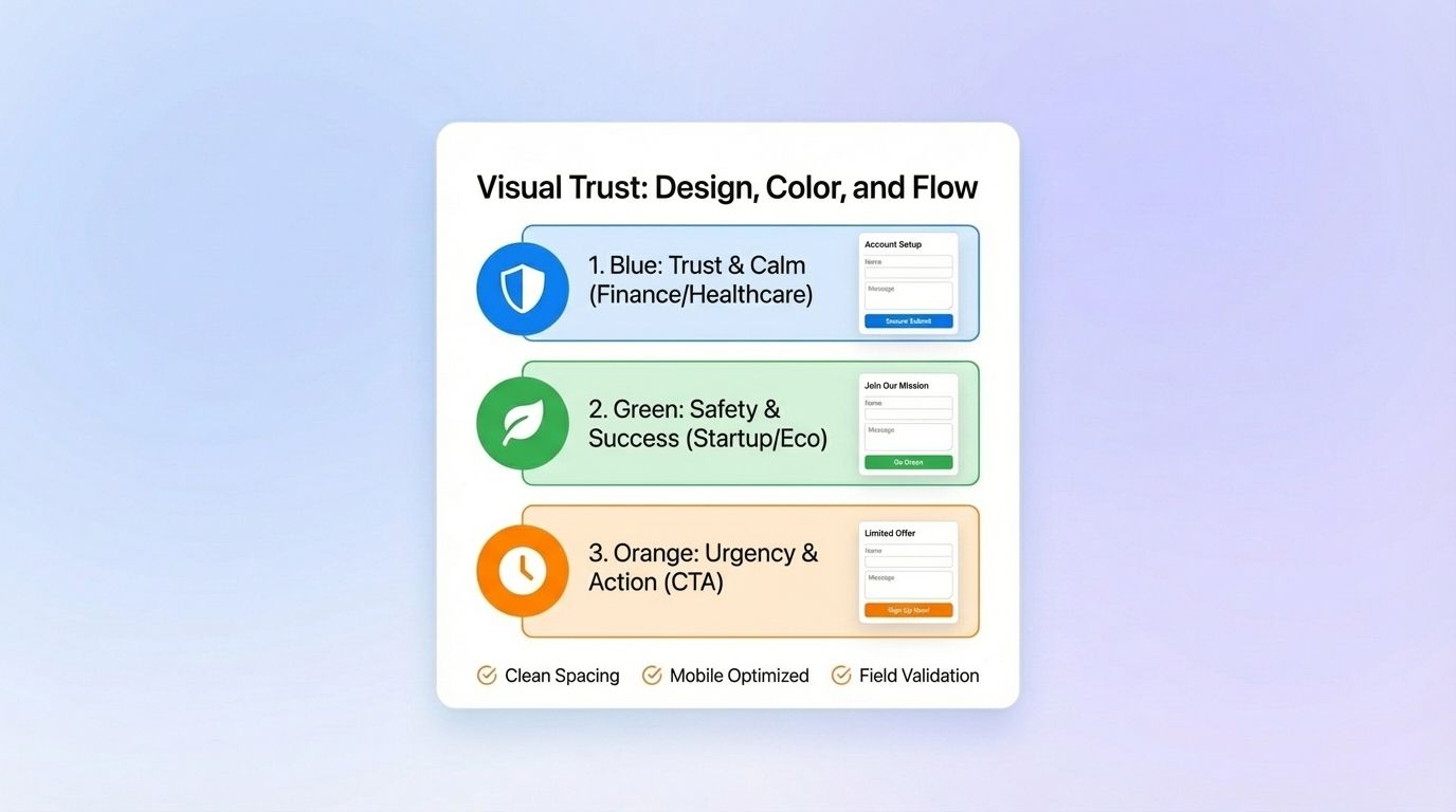
- Blue inspires trust and calm - ideal for financial or healthcare forms.
- Green signals safety and success - great for startups or sustainability brands.
- Orange or yellow create urgency - perfect for calls-to-action.
Pair this with clean spacing, mobile optimization, and form field validation.
Form field validation, only accepts correct entries to move forward. For eg, someone leaves a phone number in the email address field - the form won’t accept it. This situation can create future frustration for the respondent too. Imagine not receiving text updates for a medical policy because they mistakenly filled out the phone number field wrong. Annoying right?
In MakeForms you can easily switch on this feature, it greatly improves completion rates.
6. Data-Driven Refinement: Learn from Analytics
Analytics show which fields confuse users or cause hesitation. For example, if users abandon your lead capture form at the “Budget” question, try rephrasing it as multiple choice or using a friendlier range selector.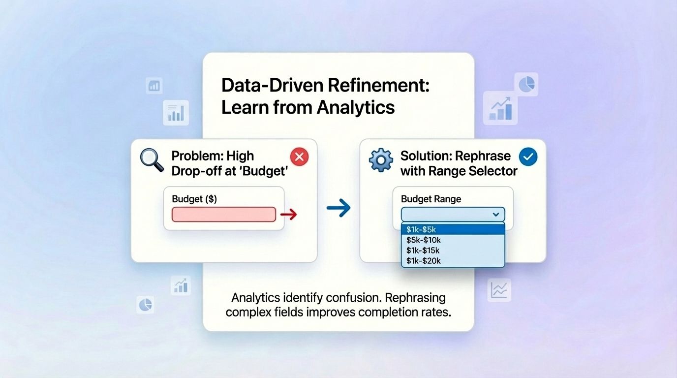
Tools like MakeForms simplify this process with two views:
- Summary View: Graphs and charts for quick insights.
- Business Intelligence View: Pivot tables and filters to analyze deeper patterns like age, income, or engagement.
Behavioral data helps you continuously refine your form, turning every insight into a small conversion win.
7. Sound Human: Write Like You Talk
Language makes or breaks trust. Robotic phrases like “Enter your email address” feel cold and transactional.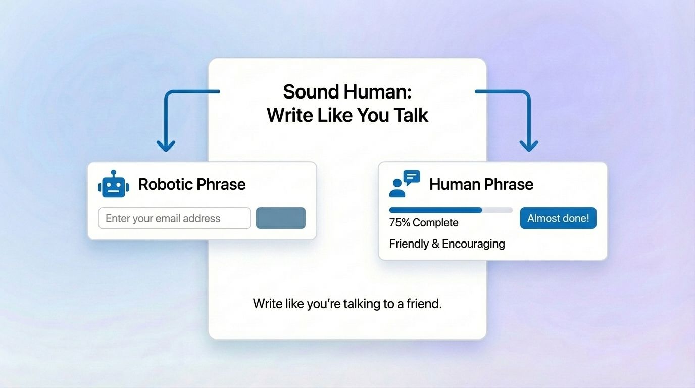
Try:
- “Where can we send your details?”
- “Let’s go” instead of “Submit.”
- “Almost done!” for progress cues.
Conversational language keeps users relaxed and makes the process feel more natural, like chatting, directly impacting completion rates!
The Psychology of Conversion is in the Details
A high-converting lead capture form is about understanding people. Every design choice, from color to field order, communicates how much you value your user’s time and trust. The best forms feel intuitive, conversational, and personal, not transactional.
Whether it’s rearranging your field order, activating smart logic, or refining microcopy, small behavioral nudges can have a massive impact on completion rates. Platforms like MakeForms bring these psychological and UX principles to life, helping you design forms that not only capture leads but also convert them into lasting relationships.
FAQs
Ideally between 5–7 fields. Enough to qualify the lead without overwhelming them.