

Lead generation is the backbone of any growing business. Without it, finding new customers becomes a constant struggle directly impacting sales and revenue.
A well-oiled lead gen system helps you collect information from potential customers and turn them into paying ones. But here's the catch: if users don’t complete the form, your lead engine stalls.
That’s why it’s so important to focus not just on generating traffic, but on lowering your Cost Per Acquisition (CPA) by improving how well your forms convert. One of the simplest, most effective ways to do that is to make sure users actually complete your lead form.
If you’ve ever wondered why your lead generation forms aren’t doing their job, then this one’s for you.
Today we’re looking at 10 real lead generation forms from companies across industries. We’ll show you what each one does well, what you can learn from it, and how you can easily build something similar (or better!) using MakeForms.
Why Your Lead Generation Forms Might Not Be Working
Before we jump into the good stuff, let’s take a quick look at why so many lead gen forms fall flat. (It’s worth checking if any of these are secretly hurting your own form’s performance.)
- Too Long, Too Soon
People get overwhelmed when they see 10 fields right away, especially when they’re just browsing. Asking for too much upfront can scare them off!
- No Clear Value Exchange
If your lead form doesn’t clearly explain what they’re getting in return, a free guide, a quote, a trial, a callback? They won’t bother filling it out if they don’t see the benefit right away.
- Bad User Experience
Slow load times, confusing layouts, forms that don’t work on mobile, all of these are dealbreakers. If filling out your form feels like a chore, your leads will bounce before you even get their name. :(
How to Fix It: Tips to Make Your Forms Actually Convert
Now that you know what might be going wrong, here’s how to turn things around. Here are 4 proven tactics we have seen work with our customers that have helped them reduce their Cost Per Acquisition.
1. Always Break Down the Form into Multiple Steps
Long forms can feel overwhelming. A multi-step form helps break down the form into smaller chunks keeps users engaged and reduces drop-offs. Plus, it feels like less effort, even if you’re asking the same number of questions. If you're deciding which approach works best for your audience, understanding single-step vs multi-step forms can help you create a smoother user experience and improve completion rates. Reviewing a Figma ai review can also provide insights into how AI-assisted design tools help create more intuitive user flows. In professional or international contexts, working with a localization partner can also help ensure that each step is clearly understood across languages, improving completion rates and user confidence. In professional or international contexts, working with a
localization partner can also help ensure that each step is clearly understood across languages, improving completion rates and user confidence."
2. Use Auto-Progress Forms
You know those forms that intuitively move to the next question without having to click ‘Next’ - they’re called Auto-Progress forms. When a user makes a selection, the form should instantly move to the next step, making the entire experience feel smoooth. On the marketing side, an
Amazon PPC Agency often works to streamline ad journeys so users move toward action without friction. This alignment between user flow and targeting strategy helps reduce drop-offs and keeps interactions moving naturally toward conversion. For paid campaigns, form performance should never be judged in isolation. A form may look successful because it gets submissions, but the real question is whether those submissions came from the right campaigns, audiences, and ad creatives. That is why marketing teams often connect form results with Linkedin ads data, so they can compare clicks, spend, campaign groups, sponsored leads, and actual conversions in one reporting workflow. Once that data is connected, it becomes much easier to see which campaigns are producing qualified leads and which ones are only increasing CPA without bringing real value.
3. Optimize Load Speed
Even if you’ve created the best-designed form, it won’t convert if it loads slowly. A quick-loading form keeps users from bouncing and boosts your chances of getting that submission, just like the best
link building tools improve performance and efficiency in SEO campaigns. With MakeForms, of course the speed is built-in, but it’s always worth testing and optimizing.
Speed and design get a form seen, but increasingly that's not the only audience that matters — AI chatbots like ChatGPT and Perplexity are now a discovery channel too, recommending forms, tools, and resources directly in their answers. Investing in LLM SEO helps your lead generation forms and the pages hosting them get cited by these AI answer engines, putting you in front of prospects who never type a query into Google at all.
4. Verify Phone Numbers Now to Avoid Wasting Ad Spend Later
Imagine your leads pouring in but then they turn out to be fake! Ugh. Did you know you can add phone number verification to your forms to filter out invalid entries. This, paired with the best lead generation tools, ensures every lead counts and your sales team focuses on conversions instead of cleanups.
10 Lead Gen Forms That We Loved - and Why!
Alright, let’s get into it. We’ve put together examples from the following industries:
- Movers and Relocation Services
- Home Improvement & Repair Services
- Mortgage & Home Loans
- Professional Services (Consulting, Finance, Legal, Design)
- Creative & Digital Agencies
Movers and Relocation Services
This lead generation form is a great example of how to collect detailed customer info without overwhelming the user.
1. Smart ZIP Code Suggestions
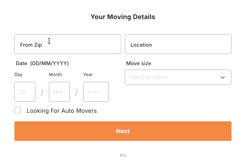
The form begins with a simple "From" and "To" ZIP code entry. As users type, the system suggests matching locations. So right away the user has been helped with a relevant information match, making the experience fast and friendly.
You can replicate this seamless experience in MakeForms by integrating the Google Address Autocomplete field, ensuring users enter accurate information from the get go.
2. Multi-Step Form Design
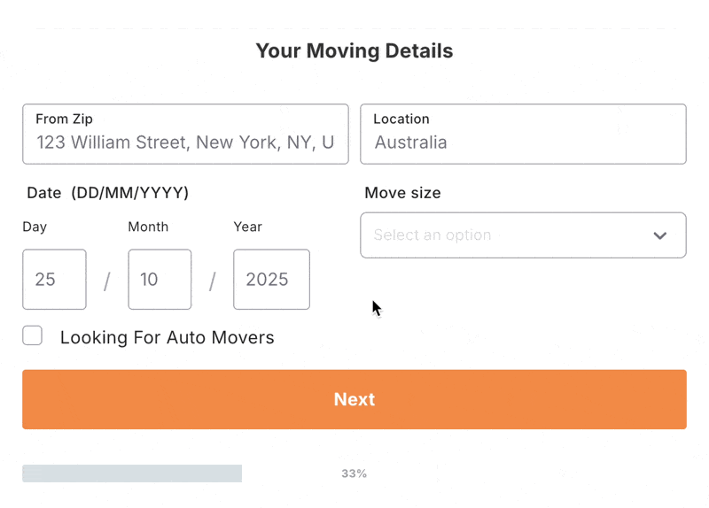
Instead of showing everything at once, the form breaks the process into a Multi-step form. Step one asks for the moving details, and step two asks for personal info like name, email, and phone number. This ensures that only users who find a matching PIN code move forward to enter their contact information, meaning the company receives leads that are both relevant and ready to convert.
3. TCPA Compliance
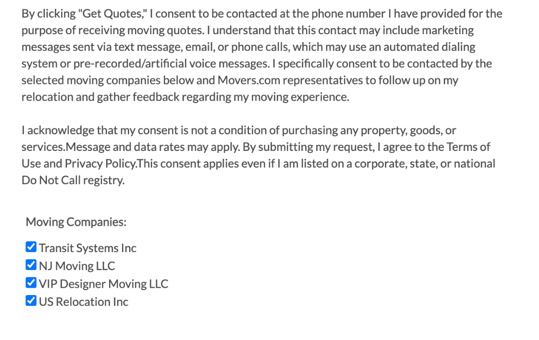
Movers also includes a TCPA compliance disclaimer at the bottom of the form, ensuring users provide explicit consent to be contacted via phone. Since Movers.com distributes leads to third party moving companies, they offer users the option to choose which companies they’d like to receive quotes from.
This practice aligns with the FCC's latest One-to-One Consent Rule for TCPA, which mandates businesses to obtain clear, prior consent before contacting leads. With MakeForms, you can seamlessly integrate a TCPA Consent Field to create lead generation forms with TCPA Consent.
There are various other types of compliances required in your forms depending on your industry. If you need a HIPAA Compliant Lead Form you can check out our page devoted only to that.
This lead gen form uses clean visuals in a multi-step form format, easing users into the process and filters leads early based on service type.
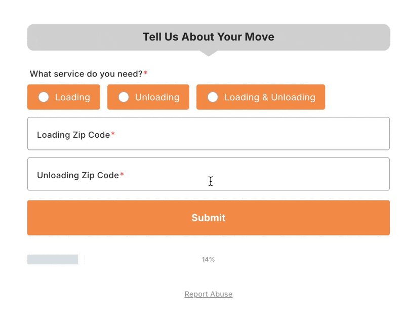
4. Visual Binary Choice Cards
Hireahelper uses visual choice cards very well to make the first step simple and engaging, it’s excellent for mobile users who want to make quick decisions. By keeping it clear with just two options, it is using the “Foot in the door” technique with a small, low-effort first action increasing their likelihood of completing the whole form.
Use the Image Choice field inside a multi-step form with auto-progress turned on to replicate this smooth, user-friendly experience on MakeForms
5. Conditional Logic to Adapt to the User’s Needs
Their next step builds on Step 1 seamlessly, after selecting the service type, users are immediately guided to enter specific move details like ZIP code and date. Behind the scenes, conditional logic ensures that the form adapts based on the user’s choice in Step 1, only showing fields that are relevant to their selection. This lead generation tools keeps the experience clean and personalized.
The final CTA “Compare Mover Prices” of this section also adds to how much benefit the user is getting by filling out this section. So it doesn’t feel like the user is being sold a service, instead, it feels like they’re being empowered to make an informed choice. That small shift in tone builds trust and encourages form completion.
In MakeForms as well you can easily apply Conditional Logic to adapt questions based on the service selected by your user.
This form keeps things ultra minimal and leads with location based inputs, which are essential for any moving or relocation quote.
6. Single Step Start with a Clear CTA
Universal Relocations starts their lead form with just two fields “Moving From” and “Moving To.” These are the most critical inputs for a moving service, and by asking them first, the form instantly qualifies the lead and filters out unserviceable routes early, improving lead quality and reducing backend clutter.
But the highlight is definitely the bright “Get your free quote” offering value right away, making it feel more like a helpful tool, than a form.
7. Clean, Sequential Flow with Smart Field Types
It continues on it’s minimal energy in Step 2 by asking just two questions again, “Move Date and Move Size” - interestingly still no personal information, which means there is going to be very little resistance to fill this out as well.
The smart use of the calendar picker and drop down for complex data should also not go unnoticed. It reduces manual typing, formatting errors, and simplifies data into a single decision
You can use validated field types in MakeForms for dates, dropdowns, and even add helper text for clarity.
8. No Fuss Capture
This final step wraps up the form with a clean, no-fuss contact capture, collecting just the basics: Name, Email, and Phone Number. By this point, the user has already invested time filling out move details, so this step feels quick and easy, not like a commitment.This is a great example of how progressive data capture works well in multi-step forms. Each step builds trust, making the final ask feel quite natural.
With MakeForms this where you could add field validations and optional phone OTP verification to further improve lead quality.
Home Services
This lead generation form, designed for home service requests, does a great job of making the process feel friendly and approachable, one step at a time. Home services is one of the highest-converting niches for lead gen forms — trades like plumbing, HVAC, and electrician lead generation rely almost entirely on capturing local intent at the exact moment someone has an urgent need, making form design and conversion rate a direct revenue lever.
1. Multi-Step Form with Progress Indicator
All Star Pros uses a clean multi-step form with a progress bar to guide users through the experience. Starting with a simple ZIP code entry, the form immediately filters for local service availability, a smart move for home services. This means users who can’t be served don’t waste time filling in the rest. And then it gradually builds toward more detailed questions.
With MakeForms you can easily add a Progress Bar which helps reduce form abandonment by letting users know exactly where they are in their form.
2. Optional Detail Capture That Feels Optional
In Step 2, users are asked if they’d like to share project details, but it’s not forced. The field feels open-ended and non-intimidating, which helps capture more qualified leads without creating pressure.
In MakeForms, you can mark certain fields as optional and add helper text to guide users gently.
3. Address Input with Autofill
Only in Step 3, the form asks for a street address and even autofills the city based on the ZIP code, making it easier for users to complete the rest of the form quickly.
You can replicate this with conditional field population and address validation in MakeForms.
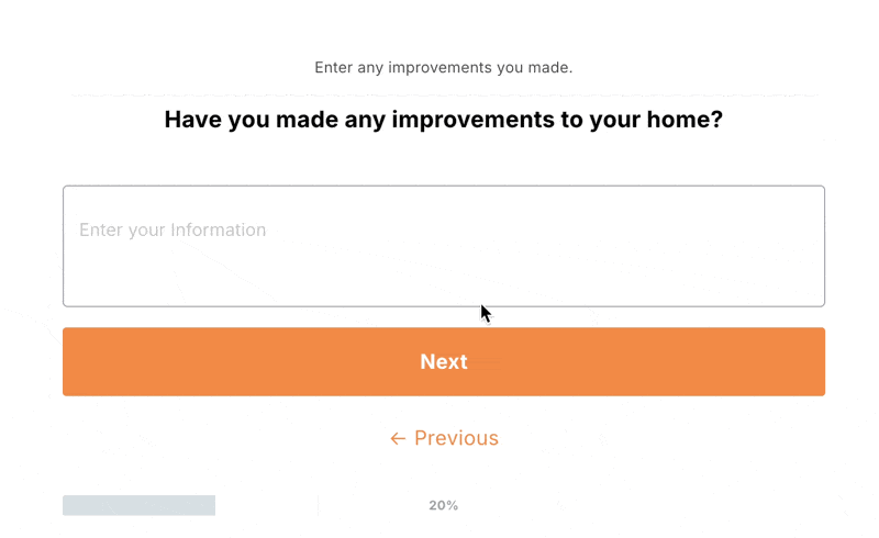
Home Improvement & Repair Services
This lead gen form does a great job of making potential buyers feel like they’re actually starting the journey toward homeownership, not just filling out a form. Since applying for a home loan can feel intimidating (especially when it involves personal financial info), this form smartly breaks things down one question at a time. That gentle pace helps users feel more in control, making the process less awkward than a face-to-face or phone conversation.
1. Hook Them with Value
This form sets the tone by offering something genuinely helpful: a free home purchase qualifier. Instead of “Fill out this mortgage form,” it’s “Let’s find out how much home you can afford.” Much friendlier.
There’s also zero mention of paperwork or stress, just a single ZIP code field and a big, cheerful “GO!” button. It’s playful, low barrier, and super clickable.
2. A Friendly, Guided Quiz Vibe
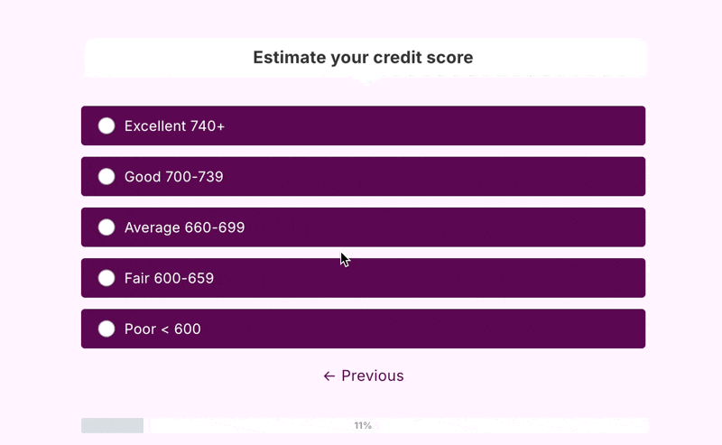
We love the use of a smart mix of answer formats to keep things quick and comfortable. Instead of making people type everything out, questions like “What type of property are you purchasing?” and “Estimate your credit score” are presented as button-based choices, fast to click, easy to understand.
Even sensitive info is handled gently with range options, so users don’t have to dig out exact numbers. Using Using interactive content, including sliders, always feels lighter and more engaging, especially on mobile.
You can easily recreate this with MakeForms by mixing choice fields, range sliders, and conditional logic to guide users without overwhelming them.
NerdWallet’s lead form brings their signature clean, content-first approach into the mortgage space, and it really works. Buying a home is a big decision and these guys know their users are often still figuring things out. So instead of asking for specifics right away, this form educates while it qualifies.
3. Clear Choices, No Guesswork
It starts with a simple question: “What type of property do you want to buy?” Each option comes with a quick one-line explanation. That means users don’t need to Google what a “Manufactured Home” is before selecting it. It’s approachable, educational, and helps people feel more confident about their choice.
The layout is super mobile-friendly, plenty of white space, clear buttons, it’s a form that reads like a checklist.
4. The Right Input for the Right Question
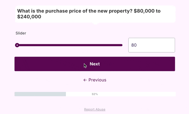
They also show only one question at a time, which makes the form feel more like a conversation than a questionnaire. Instead of throwing everything at the user upfront, they gradually get deeper, starting with simple choices and moving toward more personal or financial questions once the user is already engaged. This pacing helps reduce drop-offs and builds trust as the user moves through each step.
NerdWallet’s form keeps things light by switching up the input style based on the kind of question being asked. They use radio buttons for clear choices like how you’ll use the property, when it comes to budget, they swap in a slider - because no one wants to type “$400,000” into a box. It’s quicker and cleaner. For timing questions, like “When are you looking to purchase a home?”, they provide a detailed list of timelines, also making it feel okay to say “I’m not sure yet.” We love that, and so will your user.
With MakeForms, you can mix multiple choice, range sliders, and long-option lists just like this, to keep users engaged without overwhelming them. If you’re building forms for the real estate space, check out our deep dive into Real Estate Lead form and how better forms can transform lead quality and quantity.
Professional Services (Consulting, Finance, Legal, Design)
This form understands that most people don’t know the ins and outs of advisory services - they just know what they think they need help with. So instead of asking for context upfront, it lets them self-identify their intent, and tailors the rest of the form based on that.
5. Quick Start, No Typing
The buttons are touch-friendly and nothing requires typing this early in the journey. This matters when you're trying to capture intent quickly before the user bounces.
6. The Form Changes Based on Your Need
The form immediately adapts to show questions relevant to that choice. That’s conditional logic done right, no extra questions, just a tailored flow that feels personal from the start. Even the "Most popular" digital badge on the selected card helps build social proof and nudges users to choose the default option with confidence.
You can build this same dynamic flow in MakeForms using Conditional Logic, so users only see questions that apply to them.
7. Auto-Progress + Answer Variety = Seamless Flow
After selecting their main need (like “Accountant”), the form rolls forward automatically, using auto-progress to eliminate friction. Even though there is a manual “Next” button it doesn’t need to be clicked to move forward (we would suggest removing it completely to avoid confusion). Each step also switches up the format to match the question: Toggles/buttons for quick choices Checkboxes for multi-select needs, Short input field for open text like industry name. This keeps things interesting, making every screen feel fresh but familiar.
You can replicate this in MakeForms using auto-progress, mixed field types, and conditional logic - no coding needed. You can even add a “Skip this question” option in MakeForms if your form needs to feel more exploratory.
8. The Final Ask Comes After the Trust
Only at the very end, after the user has interacted, made selections, and seen progress, does Unbiased ask for contact info. And even then, it’s just one simple field: an email address. Just a soft, value-driven prompt: “Where should we send your match?”
That line flips the script. It’s not “give us your info,” it’s “we have something for you — where can we send it?” This is how you collect leads without losing goodwill.
Bark, an interior design marketplace, knows that most users are in a casual, browsing mindset, not in a “fill out a 10-step form” mindset. So they lower the barrier of entry with a one question at a time form.
9. Low Effort Questions
It starts with one promise: “We’ll help you compare quotes.” That’s it. Simple, direct, and effective.The ask of a pincode, is also low effort and safe, so no commitment, just a “see what’s available near you.” type of vibe. Nothing to spook users into abandoning the form yet. But it only gets better from here.
10. Clean. Calm. Clickable.
What makes this experience shine is the progressive flow, each step is not just asking for input, it’s helping the customer think through their own needs. By the time they finish the form, they’re ready to receive quotes and are clearer on what they want.
The calm design look and feel also adds to the efficacy beautifully. The progress bar at the top is just enough visual encouragement without rushing the user. And each question is matched with the right input format, you have check boxes, radio buttons, and sliders.
In MakeForms, you can mix checkboxes, radio buttons, dropdowns, sliders, and short answers, all inside a multi-step form, to build this kind of intuitive journey in minutes.
11. Bark Goes the Extra Mile
These final few screens are where Bark.com truly goes the extra mile. After the user has answered all the questions, they're greeted with a reassuring progress update saying, “Curating top matches” - it gives the impression that real effort is being put into finding the best fits.
Then, instead of just dumping a request for contact info, they ease you into it. A celebratory message, “Great! We've found you the perfect matches” before they ask for your email.
If you try to quit the form, Bark reminds you, “You’re just 5 steps away from your list of interior designers.” It’s a smart micro-moment: subtle and motivating. These extra touches show how thoughtful UX can keep users moving forward with confidence.
The form flow on the KIJO “Start a Project” page is beautifully minimalistic. There’s a lot to appreciate here, and a few thoughtful tweaks we’d consider to make it even stronger. Let’s start with what we loved.
12. Aesthetic and Focused
The aesthetics are on point, by dedicating the entire screen to the form, it removes distractions and puts the spotlight squarely on the user’s intentions. The clean layout and gentle gradient background also add to the feel of modernity. The large buttons are very mobile friendly.
The form currently doesn’t use auto-progress, which is something we’d definitely change to keep the experience smooth and momentum-driven. There's also no email or phone number validation at this stage, which makes it easy for fake leads to slip through.
A few smart, qualifying questions, like asking about project timelines, business type, or whether they already have a website, could add some depth. With a little conditional logic, this form could go from great to perfect.
Clear Timeline CTA
At the end, the straightforward 1-day response deadline gives it a refreshing sense of assurance. We would probably also squeeze in a value-add like a downloadable project checklist to prepare for the call!
All in all, the KIJO form does a great job of setting the tone, it's clean, confident, and clearly built with user experience in mind.
Creative & Digital Agencies
We are Yellow Ball has one of the most fun design languages - it’s bold yet balanced. The dark theme, paired with bright pops of colour gives off tech-meets-agency vibes, setting the mood straight away.
1. One-Pager Simplicity
This is one of the few forms we liked that fully embraced the one-pager design with a couple of questions, and that’s probably because when it comes to creative agencies, the goal isn’t always to box users into rigid choices. At this stage, the client might not have all the answers, and that’s okay. What matters more is capturing intent and starting a conversation.
But here’s the part we liked most.
2. Filtering for Serious Leads with Smart Upload Options
Yellowball invites serious project leads with an option to attach briefs, technical scope docs or other supporting materials signals that they’re ready to work with clients who’ve already put thought into their vision. That one addition alone filters the crowd from casual browsers to committed prospects.
With MakeForms you can easily collect all types of attachments directly from your form. We support images, PDFs, presentations, word docs, and more.
Inspired by https://helloseed.co.uk/
helloseed.uk brings a fresh and friendly take on lead generation. Right from the first screen, it feels conversational and welcoming.
3. Real-Time Personalization
One of the most charming things about helloseed.uk’s form is how it personalizes the experience in real-time. The moment you enter your name, the very next question greets you with it, “Thanks Peter. What’s the name of the business you’re enquiring about?” It’s a small touch, but it instantly makes the form feel more human.
MakeForms also allows you to customize your form with first name piping, so you can greet users personally as they move through the questions
4. Friendly, Functional, and Smartly Sequenced
The form design uses a mix of input types well, open-ended text boxes for names and business info, checkboxes for marketing services, and pre-set ranges for budget. Each screen focuses on a single question, making the process feel easy to follow.
They only ask for the email at the very end—just when you're already invested—which is smart.
The thank you message is polite and professional, setting expectations about a follow-up, though adding a specific timeframe (like “within 24 hours”) could make it stronger.
Ready to Build Your Best Lead Gen Form Yet?
We hope you enjoyed our picks and found some inspiration in how different brands are using smart design, flow, and functionality to turn visitors into leads. Whether you’re into sleek one-pagers or conversational multi-steps, the takeaway is simple: good forms build trust, guide intent, and make it easy for the right people to say yes.
Head over to MakeForms, where you can create forms like these (and better) with a completely drag and drop UI. And if you need help, our team’s right there on live chat to walk you through it. Let’s make your form work as hard as you do!