Date Picker Field
The Date Picker field lets users enter only valid dates in a fixed format. It corrects invalid values automatically, so days cannot go beyond 31 and months cannot go beyond 12. This keeps all dates clean and consistent across your form.
Adding the Date Picker field
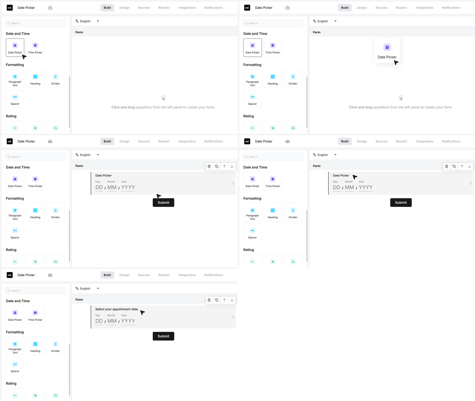
Open your form in the builder and drag the Date Picker field from the field list into your form.
Click on the label and rename it so it matches your question. For example, you can call it “Select your appointment date” or anything else that fits your use case.
Basic Settings
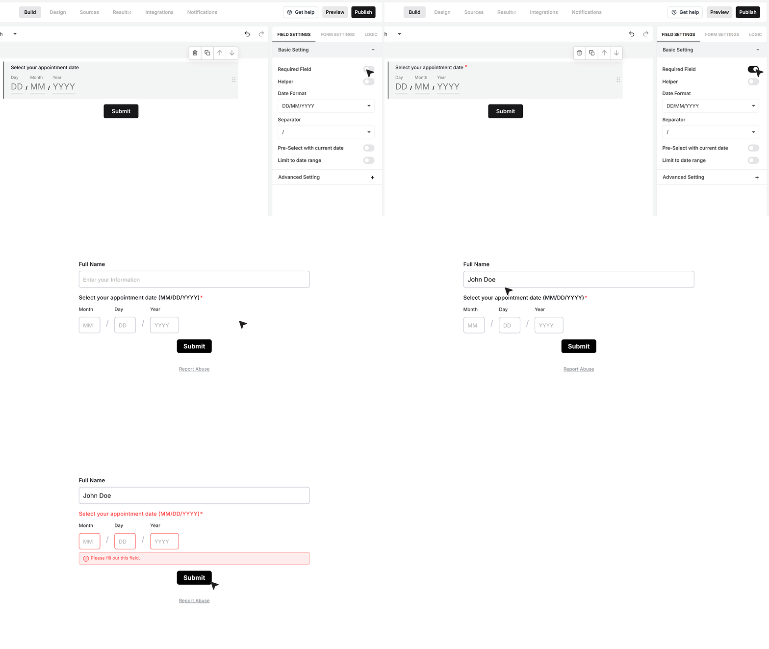
Required Field
At the top of the settings, you will find the Required Field toggle.
Turn this on if the user must select a date before they can submit the form. If they try to submit without a date, MakeForms will show an error and stop the submission until they fix it.
Helper text
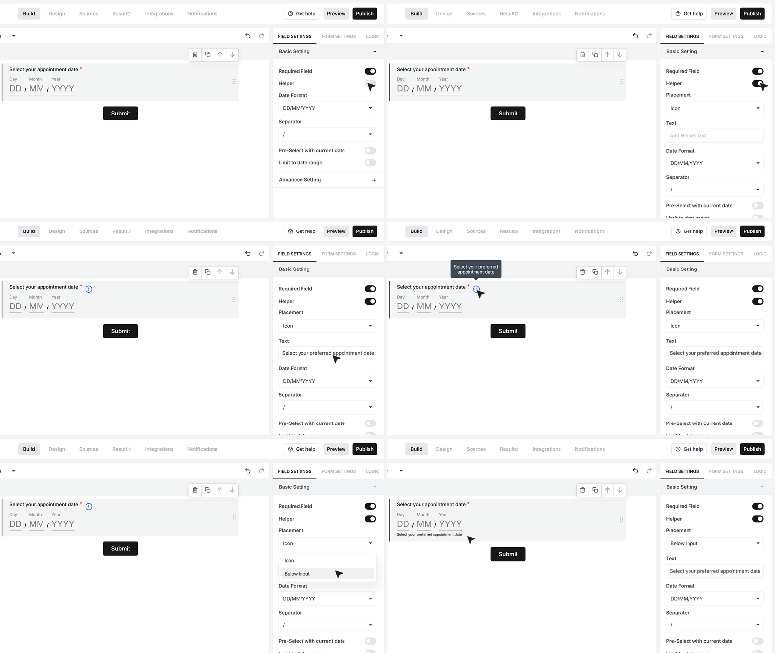
Below that, you will find Helper Text.
This is useful when the user needs more guidance. Turn it on if you want to add a short hint such as “Select your preferred appointment date.” You can choose whether this hint appears as a small info icon beside the field, where the message shows on hover or tap, or as a visible line of text under the field. You can pick the style that fits the form design you are using.
Date Format
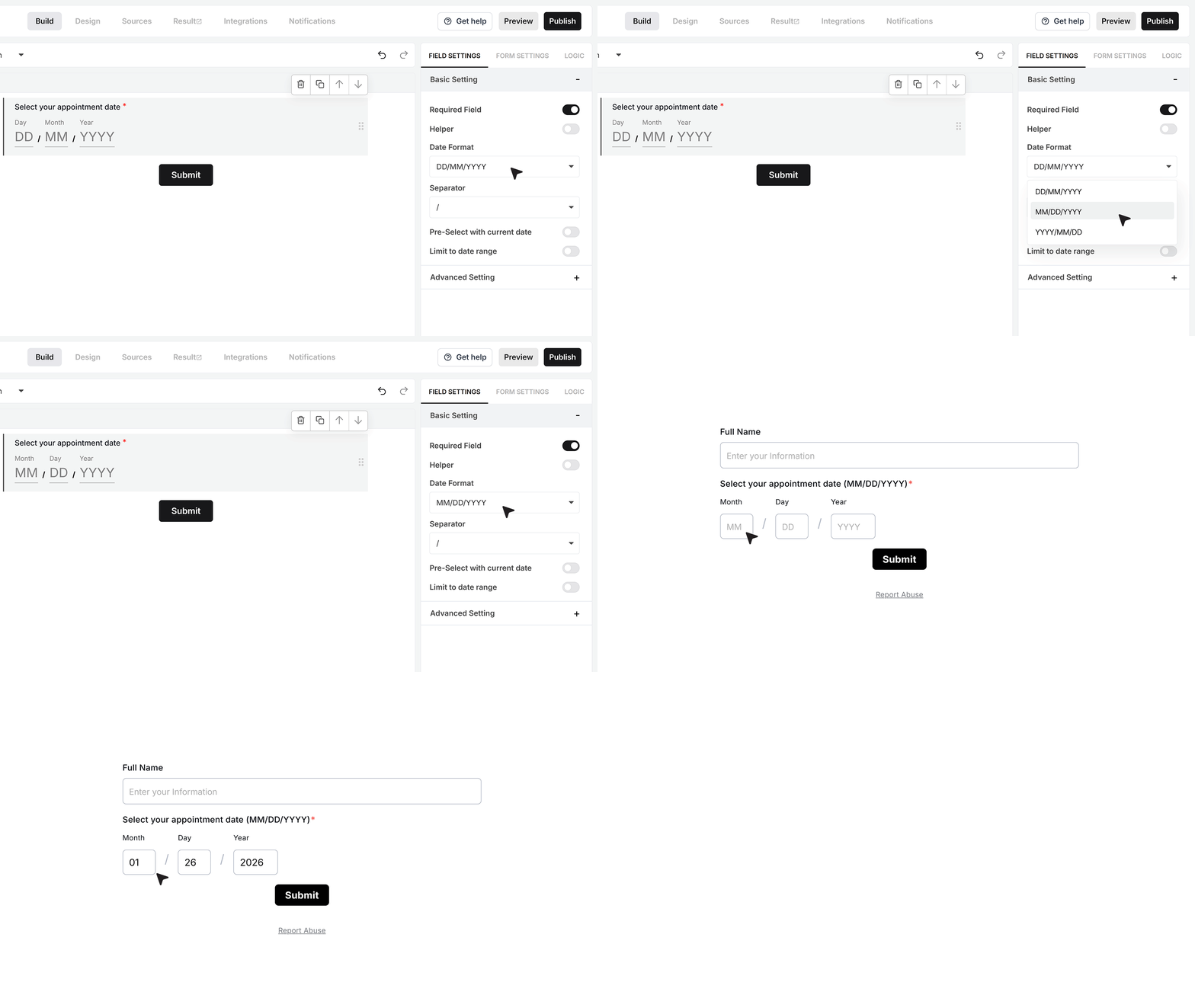
Next, you have the Date Format setting. This controls how the date appears to the user. You can choose formats like DD-MM-YYYY, MM-DD-YYYY, or YYYY-MM-DD. For example, if your chosen format is MM-DD-YYYY, the user will type 01-26-2026 for 26 January 2026. Pick the format that matches your region or how your team usually reads dates.
Date Separator
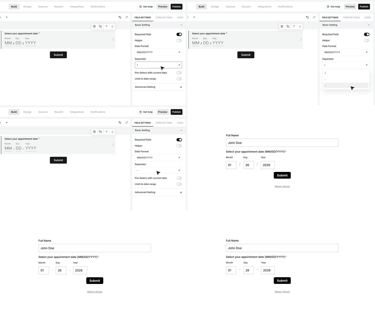
Right below the date format, you can choose the Separator setting. This controls which symbol is used between the day, month, and year. You can pick a slash /, a dot ., or a dash -. For example, the same date can appear as 01/26/2026, 01.26.2026, or 01-26-2026, depending on the separator you choose.
Pre-select with current date
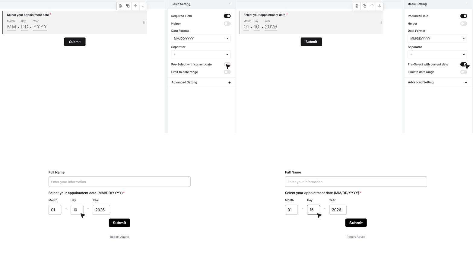
You also have an option called Pre-select with current date. Turn this on if you want the field to show today’s date by default when the form loads. The user can still change this date, but it helps when the current date is the most common choice.
Limit to date range
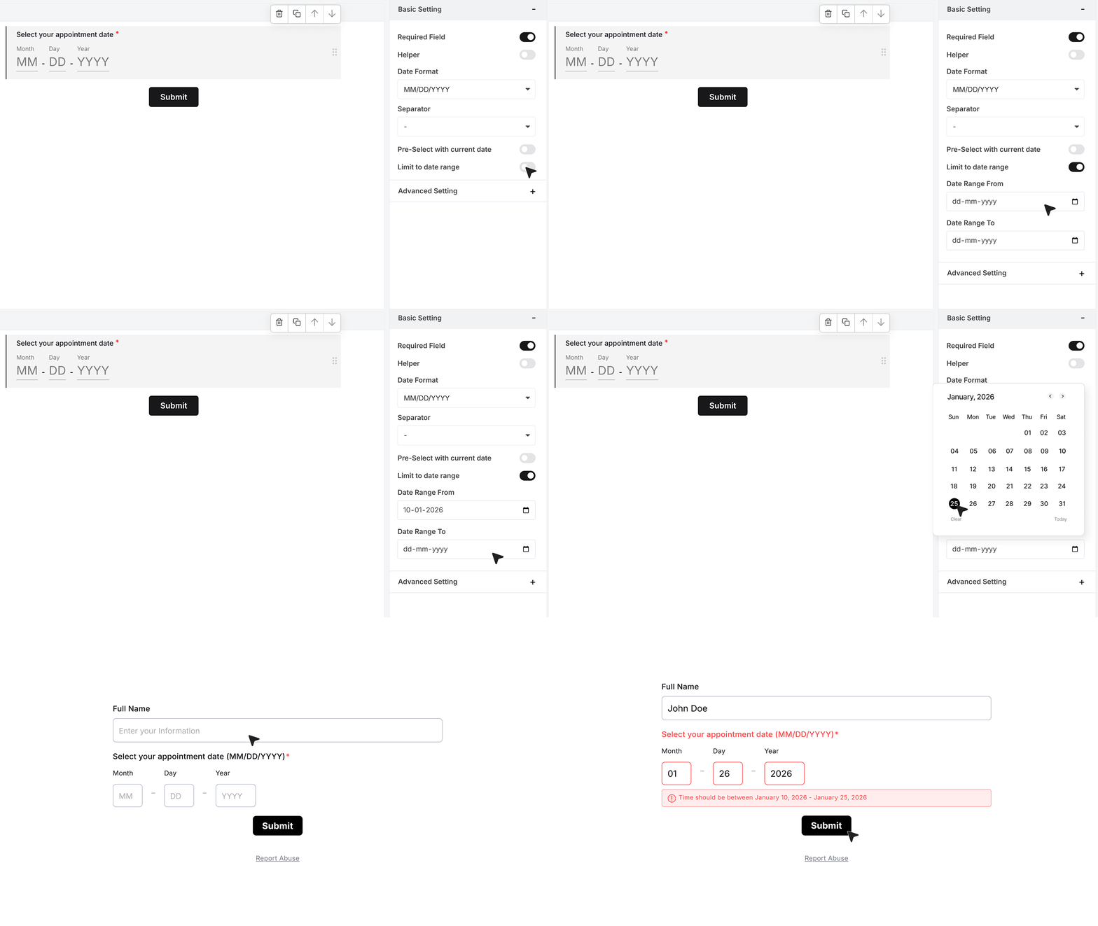
You can also limit which dates users are allowed to select. Use the Limit to date range setting for this. Set a Date Range From value and a Date Range To value. These two dates define the earliest and latest date a user can choose.
For example, if you only want users to select a date in the next 15 days, you can set today as the Date Range From and the date 15 days from now as the Date Range To. The user will then only be able to select dates inside that window. If they try to type or select a date outside this range, the field will show an error and will not accept it.
Advanced Settings
Repeat This Field
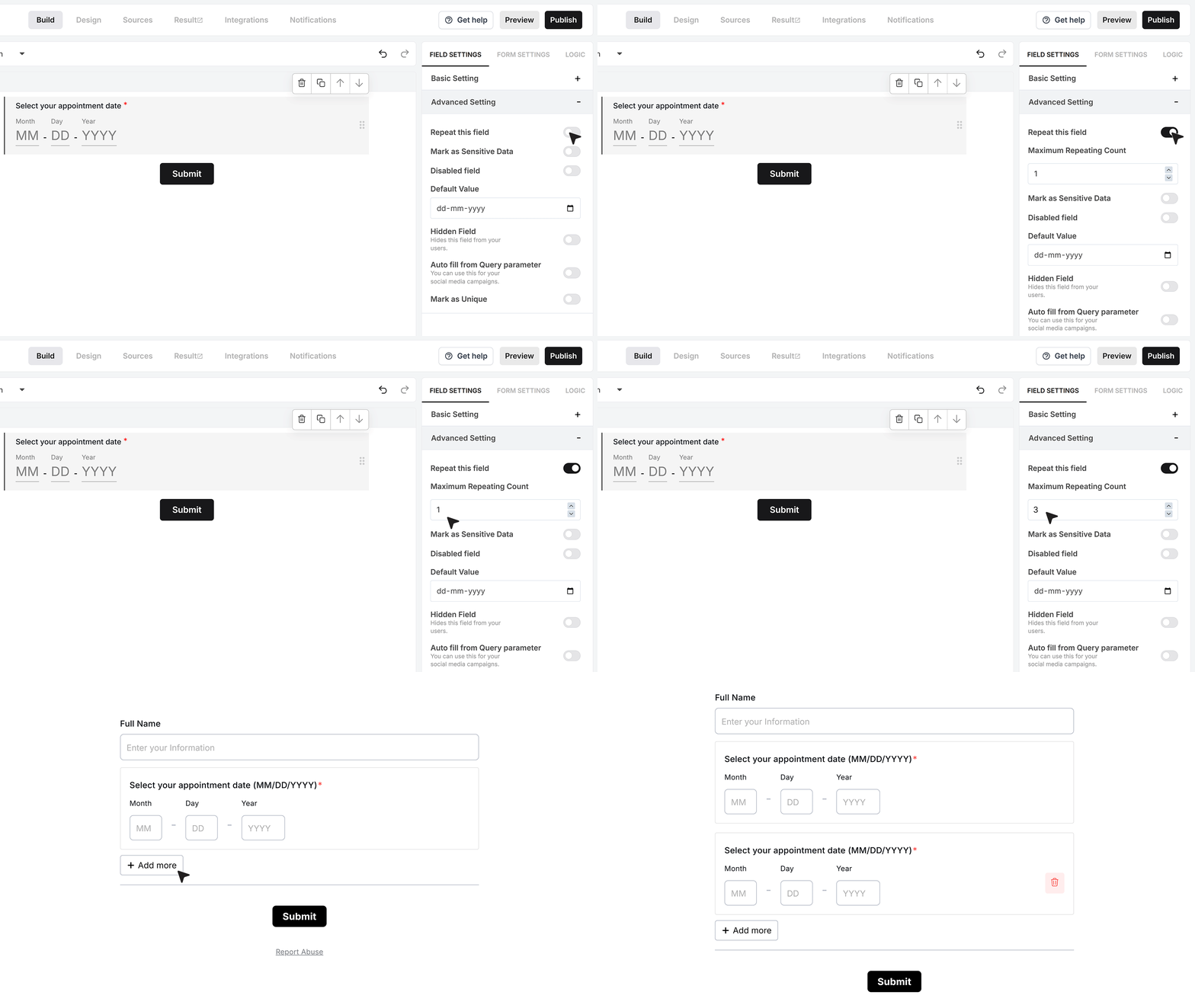
Repeat This Field allows the user to add more than one date using the same field. When you turn it on, you can choose the maximum number of times this field can repeat.
For example, if you set the limit to 3, the user will see one date field to start with and an “Add more” button below it. They can click this button to add a second date field, up to the limit you set. This works well when you want to collect multiple visit dates, session dates, or event preferences without creating many separate fields.
Mark as Sensitive Data
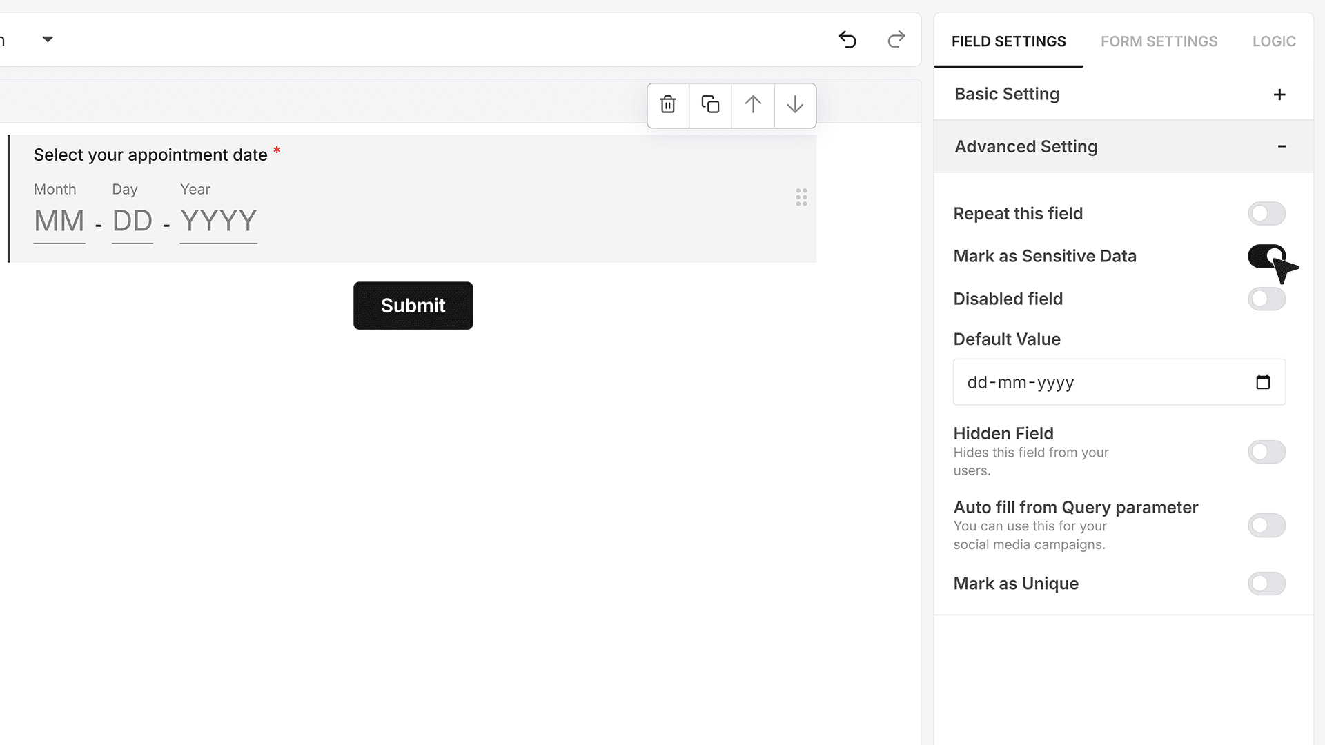
Mark as Sensitive Data should be turned on if the choices or responses should not be visible to everyone on your team.
When this is enabled, only team members with the right permissions inside MakeForms will be able to see the selected values in the responses.
Default Value
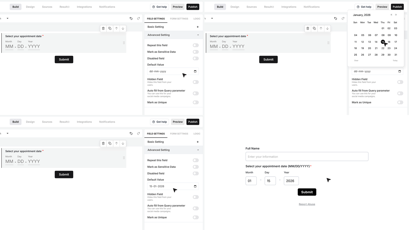
Default Value lets you pre-fill the Date Picker with a fixed date. This is helpful when there is a known date that makes sense for most users, such as a fixed event date, a deadline, or a start date. When the form opens, this date is already selected. The user can still change it unless the field is disabled.
Disable Field
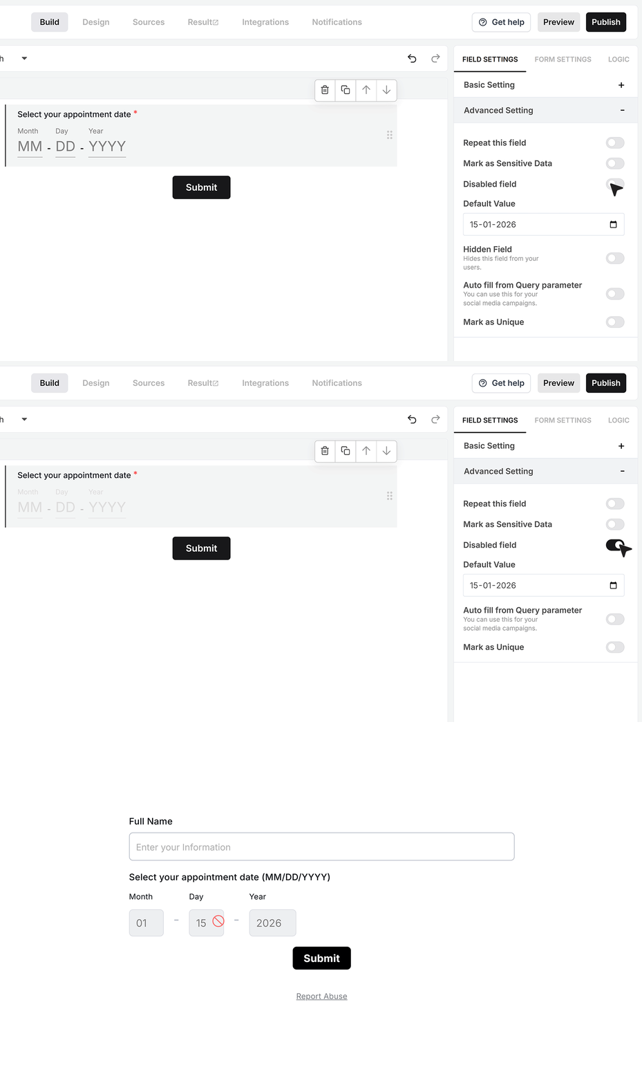
Disable Field turns the Date Picker into a read only field. When you enable this, the user can see the date but cannot change it. This is useful when you want to show a fixed, system-controlled date that should stay as it is.
Hidden Field
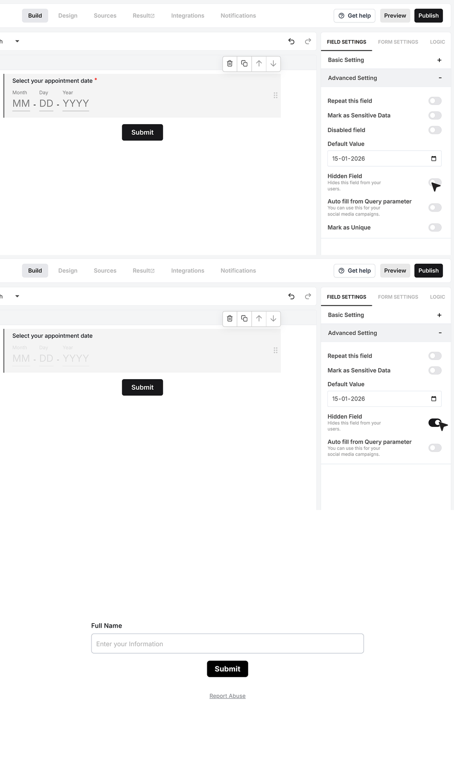
Hidden Field lets you include a date in the response without showing the field in the form. When you turn this on, the field will not appear for the user, but its value will still be submitted with the response. This is useful for internal dates or system values that you do not want the user to see or edit.
Autofill from Query Parameter
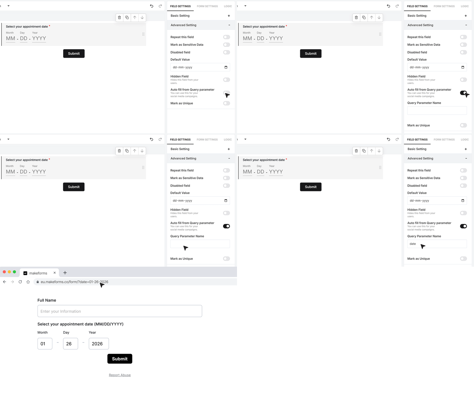
You can also use Autofill from the Query Parameter. This allows you to fill the Date Picker using a value passed in the form link. In the Advanced Settings, you enter a parameter name, for example “date”. When you share the form, you add this parameter to the URL and pass a date value in the same format that your Date Picker uses. For example, your parameter name is “date”, your link might look like:
https://your-form-url?date=01-26-2026
When someone opens the form using this link, the Date Picker will automatically fill with that date, shown according to the format you selected.
Mark as Unique
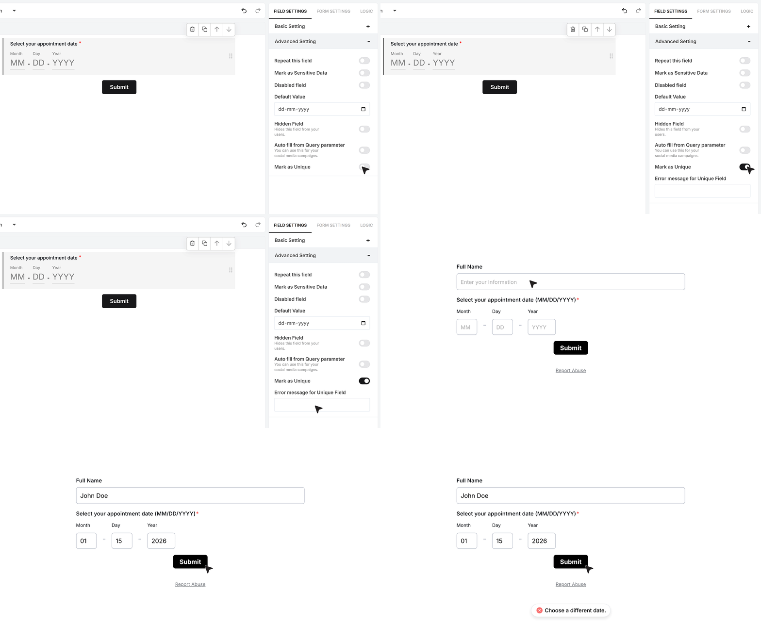
Mark as Unique makes sure each submitted date for this field is unique across all responses. Once you turn this on, you need to enter an error message that will show if someone tries to submit a date that was already used. For example, if one user submits 01-26-2026 and another user tries to submit the same date, the second user will see this error message and will have to choose a different date.
FAQ's
In MakeForms, open your form in the builder, then drag the date field from the field list into the form. Click the label to rename it, then set the date format and separator so users enter dates the way you want. If the date must be provided, enable Required Field. If you need to restrict valid dates, enable Limit to date range and set the From and To dates.
MakeForms uses a built-in date field with format, separator, default value, and range limits, and this document does not mention adding third-party date picker plugins. If you specifically need third-party date picker libraries, look for builders that support custom HTML and custom JavaScript embeds (that is usually the requirement for plugin-based date pickers).
In MakeForms, the date field stores a clean, consistent date value based on the date format and separator you choose. When you export responses (for example, to CSV), the date values will come out in that same format, so pick a format your reporting tools can parse reliably (YYYY-MM-DD is often the easiest).
In MakeForms, the date field is a date-only field with formatting and validation options, and there is no timezone setting described for it in the field settings. If timezone matters to your logic, handle timezone at the workflow level (for example, calculate the correct date in your backend, then prefill the field using Autofill from the Query Parameter).
MakeForms date input is numeric (day, month, year) and controlled by date format and separator, so the field itself is not language-heavy. For the user-facing language, set the field label and helper text in the user’s language. This document does not list a setting for month-name language or locale-specific text beyond format and separator.
MakeForms does not expose a timezone-aware mode in its settings in this document. For global flows where the “correct date” depends on timezone, a practical approach is to compute the date per user (based on their timezone) and prefill it via query parameter, then keep a fixed date range From/To to enforce validity.
Use the Date Range limit. Turn on Limit to date range, then set Date Range To to the latest allowed birth date (for example, “today minus 18 years” for 18+), and set Date Range From to an earlier cutoff (for example, “today minus 120 years”). If the user tries to enter a date outside your allowed range, the field shows an error and will not accept it.