Dropdown Field
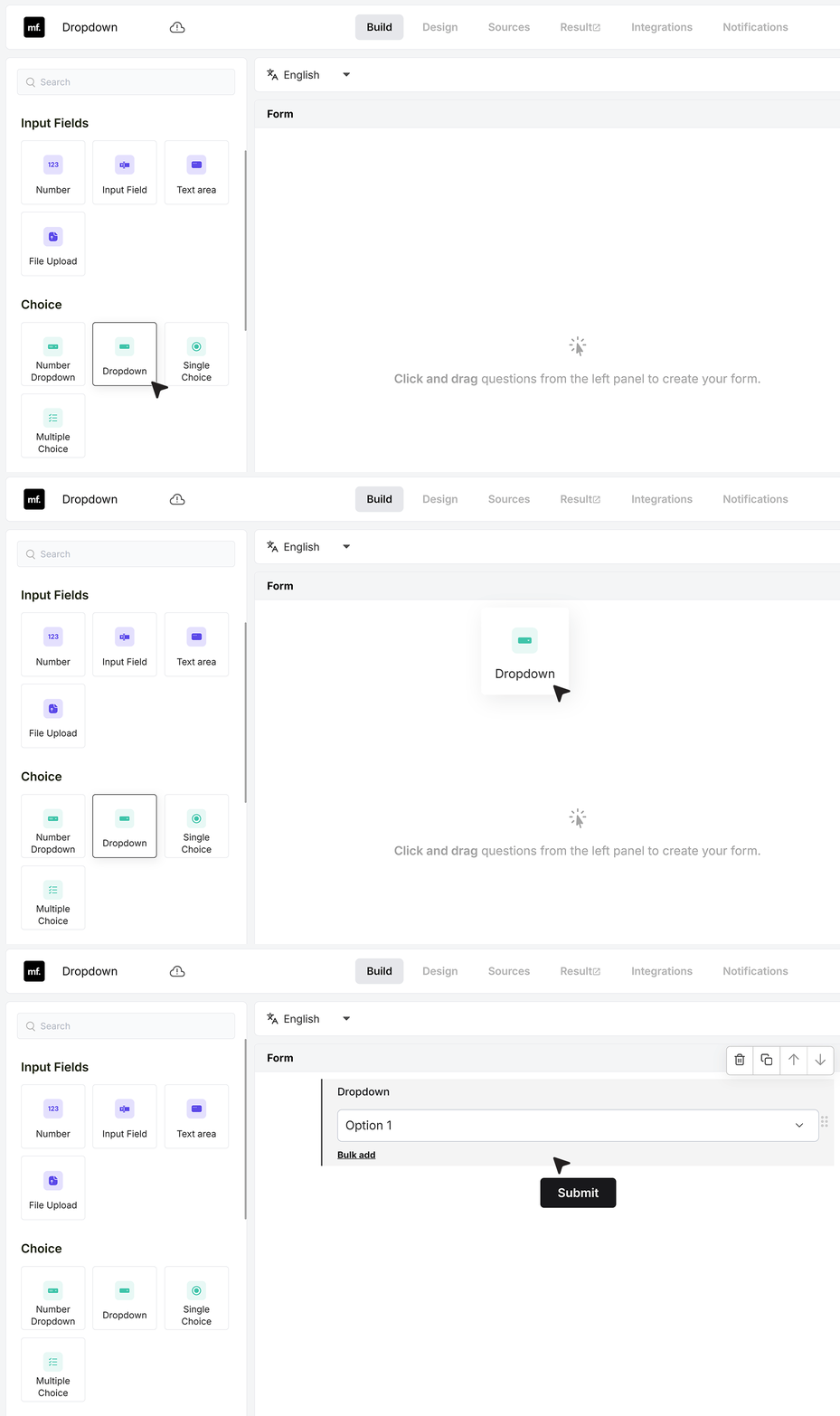
The Dropdown field lets you turn long or complex choices into a simple menu that users can pick from.
In MakeForms, you can create your own list of options or use built-in predefined lists such as countries, time zones, years, and more.
After adding a Dropdown field to your form, you’ll see its settings on the right side.
Basic Settings
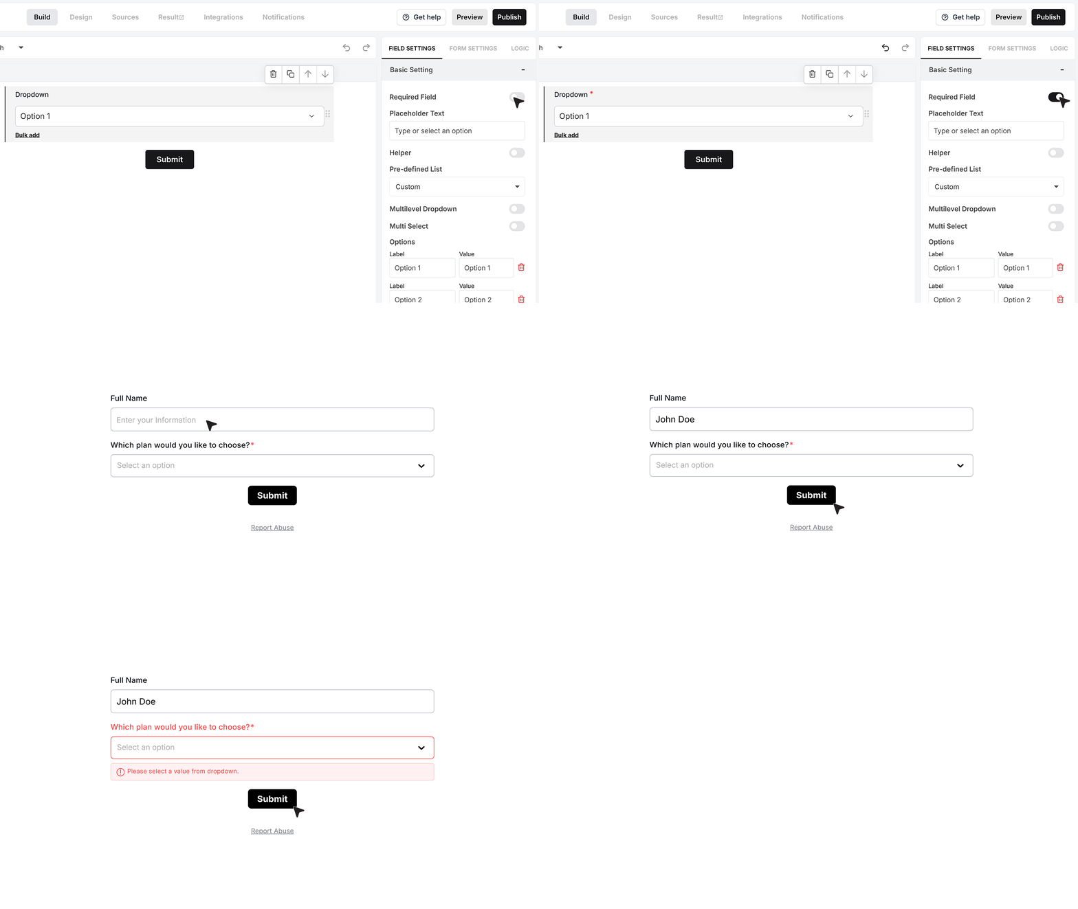
Required Field
Enable this if the user must select an option before submitting the form. If the user skips the field, MakeForms will show an error and block submission until a value is chosen.
Placeholder Text
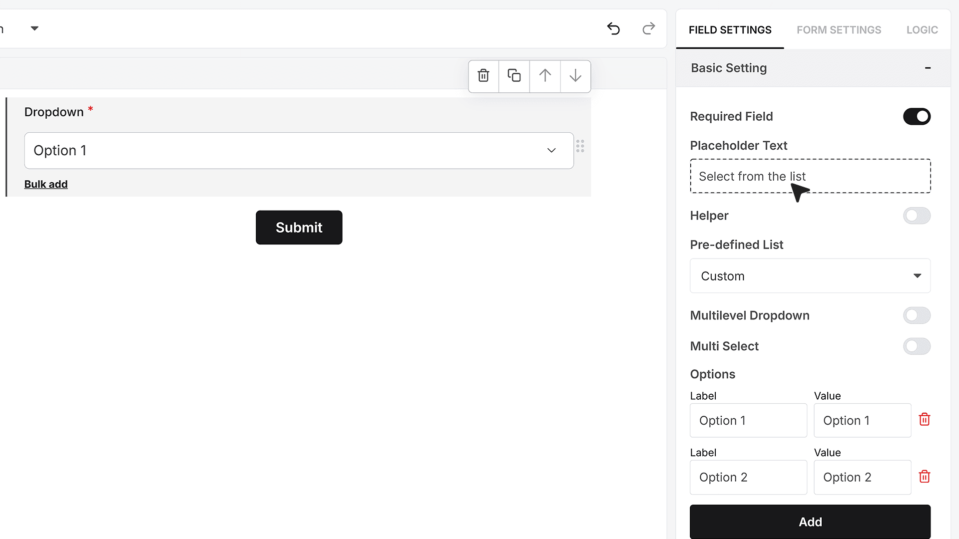
This text appears inside the dropdown before any option is selected. It acts as a hint, with lines like “Select from the list” or “Choose an option.” The text disappears as soon as the user makes a selection.
Helper Text
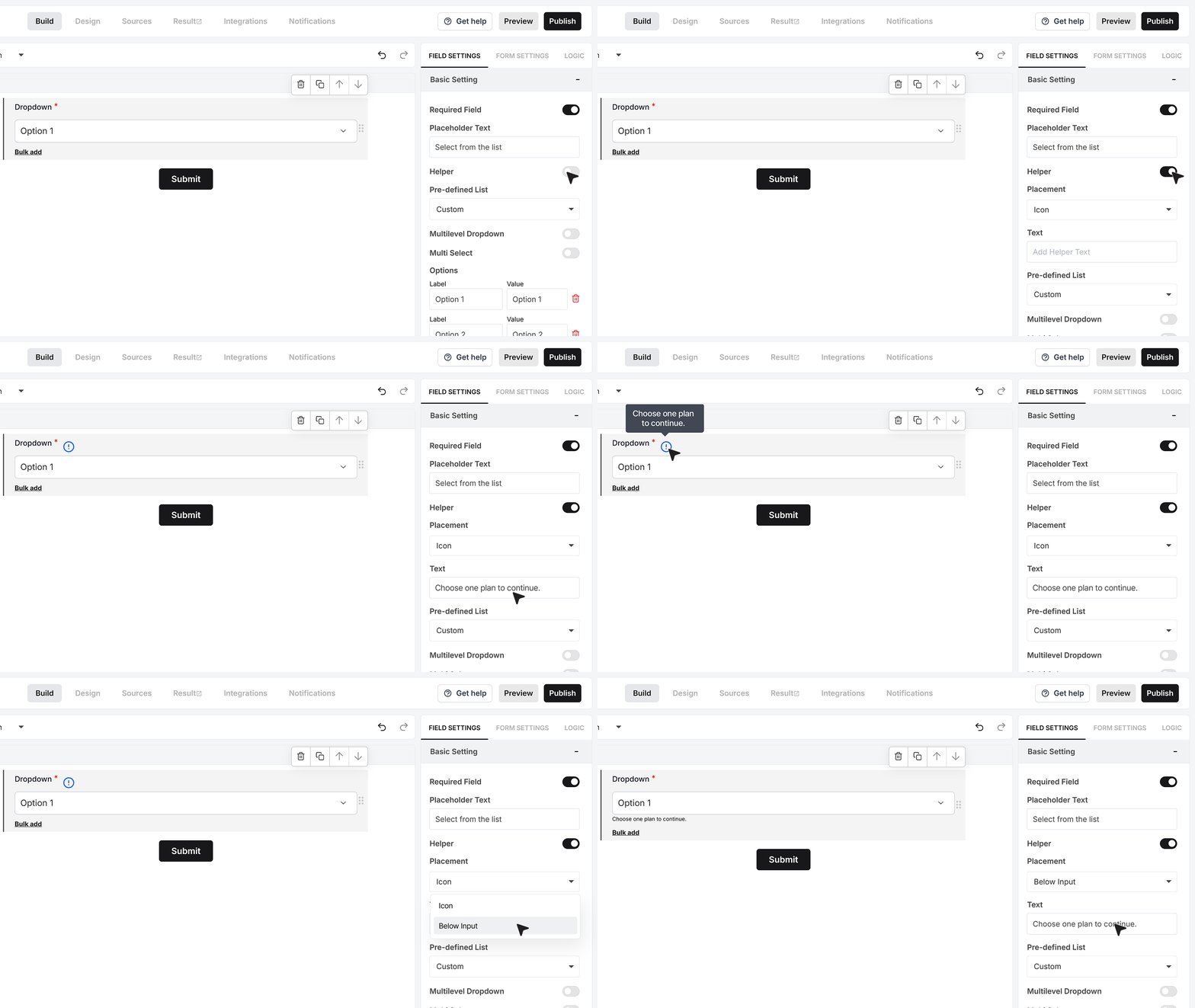
Turn this on to add extra guidance. You can type your helper message and choose how it appears. It can show as a small info icon that reveals the message on hover, or you can display it directly below the field for quicker clarity.
Predefined Lists: Custom Mode
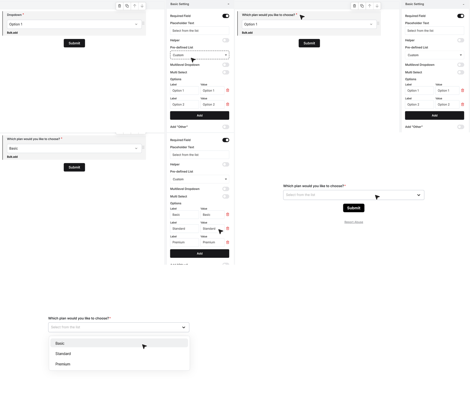
Every new Dropdown begins in Custom Mode, where you can type your own options. For example, for “Which plan would you like to choose?”, you can enter Basic, Standard, and Premium.The dropdown will display the options in the order you add them.
Bulk Add
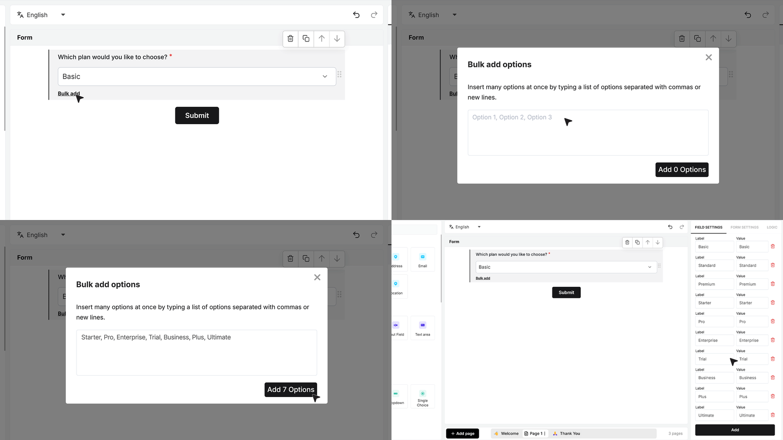
If you already have a long list, you don’t need to add each item manually. Open Bulk Add, paste or type your values separated by commas or new lines, and save. MakeForms will turn each entry into a separate option while keeping the same order. This is useful when copying choices from a document, sheet, or existing list.
Predefined Lists: Built-In Options
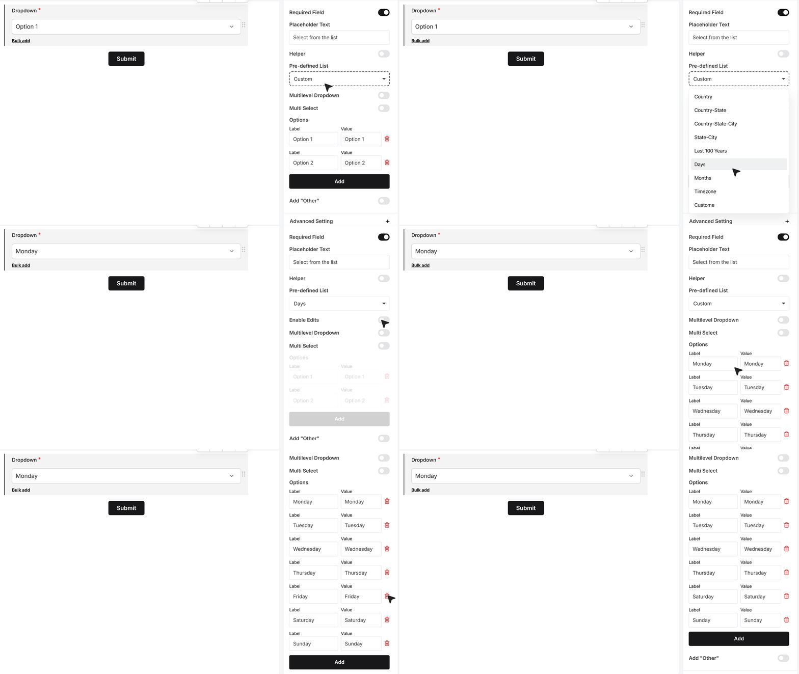
MakeForms gives you ready-made lists for common values, so you don’t have to type everything manually. These are helpful for fields that always follow a fixed pattern, like days, months, time zones, countries, states, or well-structured location sets such as Country + State or Country + State + City. If you ever need to make changes, you can turn on editing. This switches the list back to Custom Mode so you can add, remove, or update any item.
Multi Select
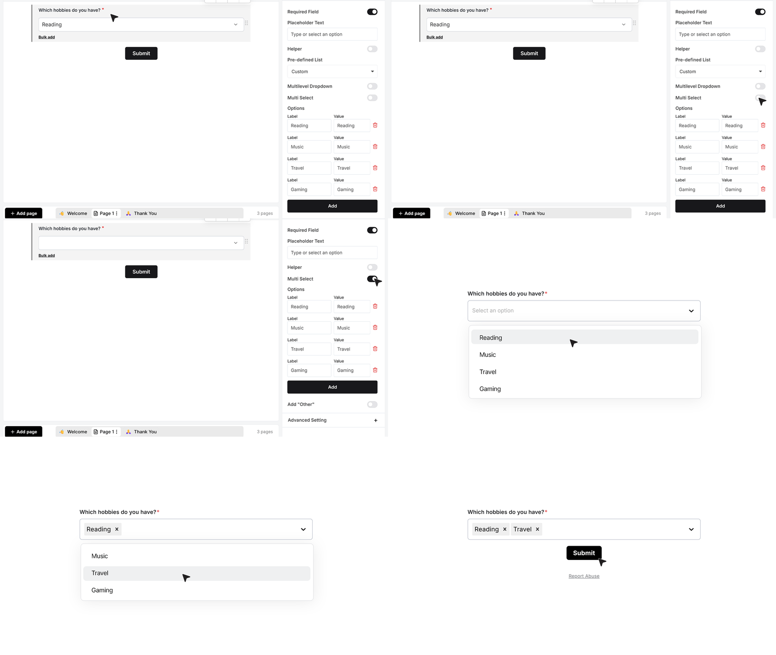
If you want people to pick more than one value from a Dropdown, enable Multi Select. For example, with the question “Which hobbies do you have?” and options like Reading, Music, Travel and Gaming already added, turning on Multi Select allows respondents to select several hobbies; each chosen item is recorded separately in the responses.
Add Other
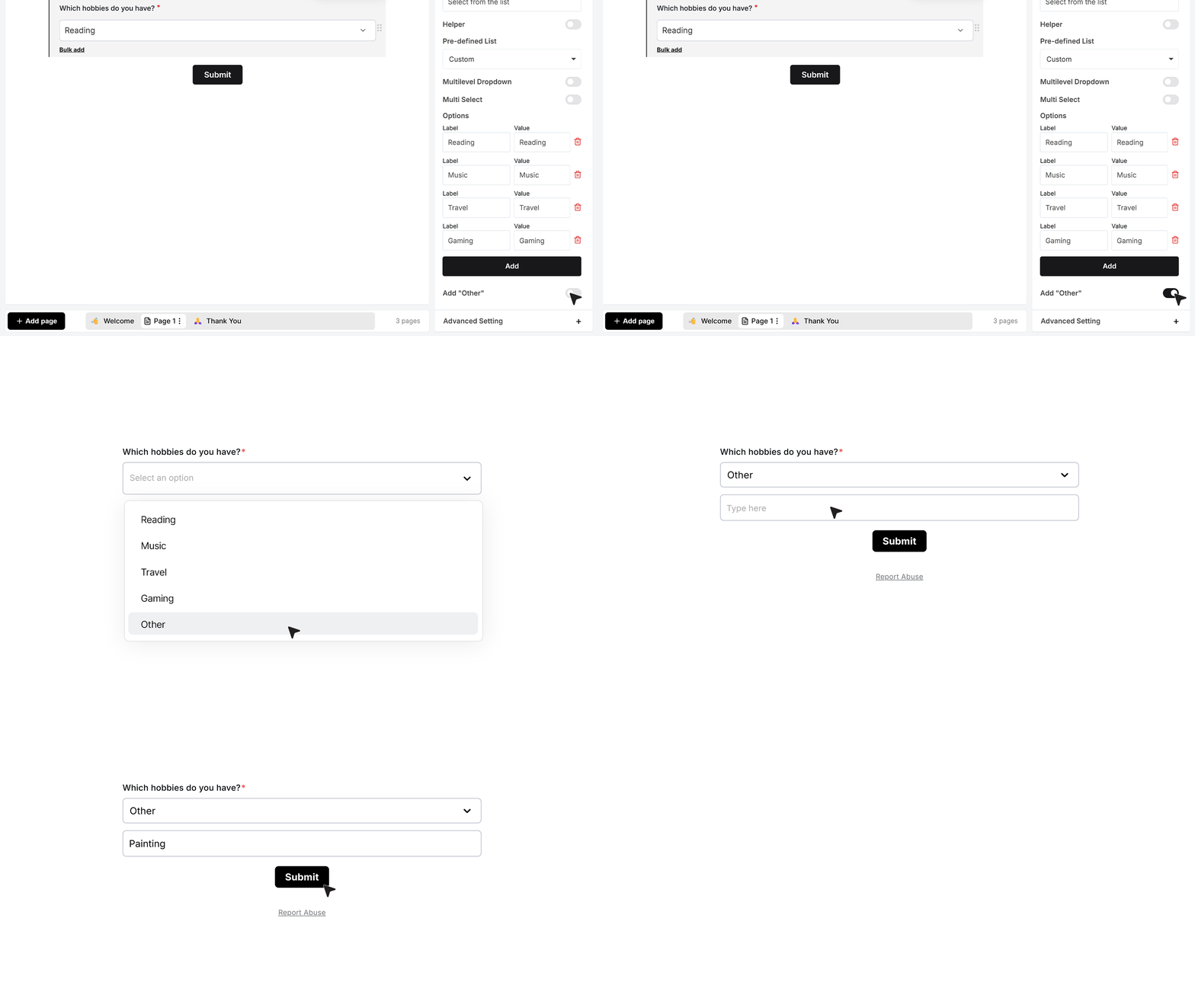
If your list may not cover every possible answer, you can turn on Add Other. When this is enabled, an “Other” option appears in the dropdown. If the user selects it, a text box appears where they can type their own answer. This helps you collect values you did not list yourself.
Advanced Settings
Repeat This Field
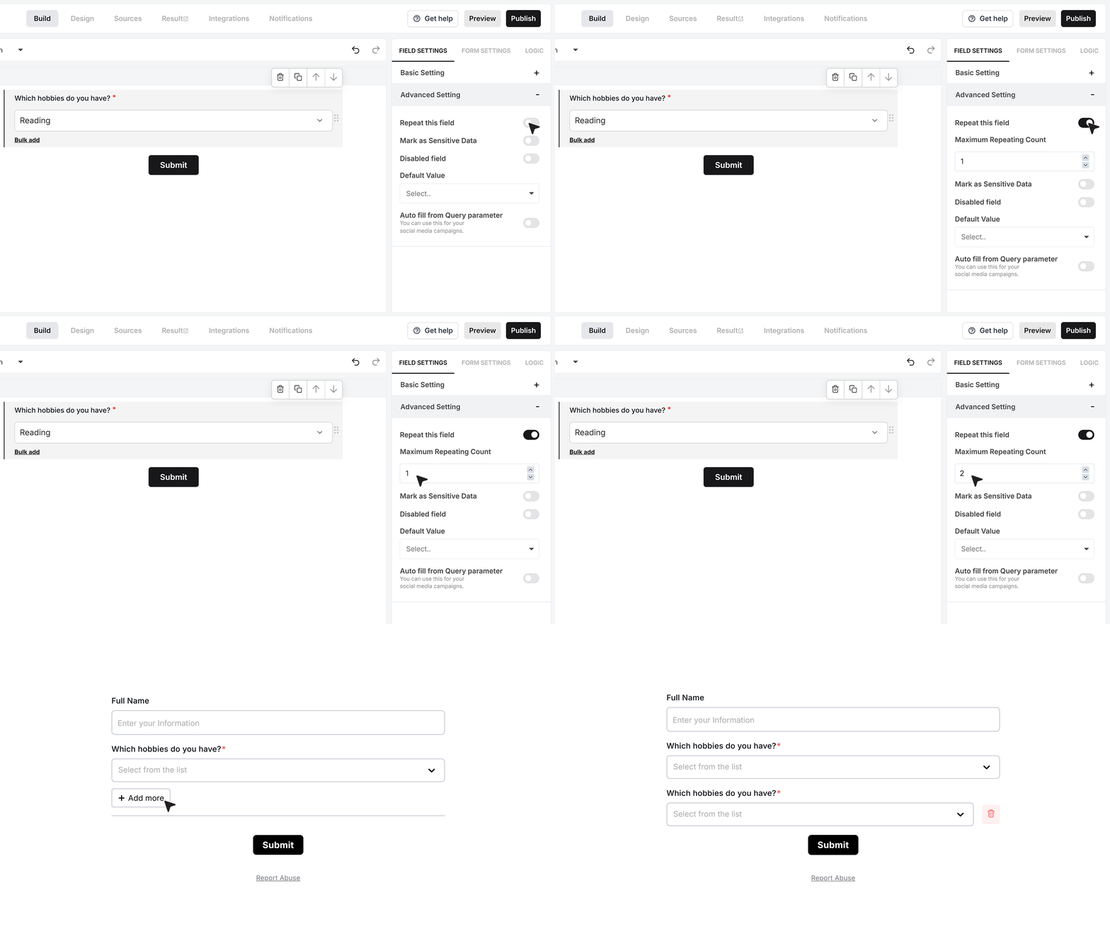
Repeat This Field lets the same dropdown appear more than once in the form. When you turn this on, you can set how many times the field is allowed to repeat. This is useful when you want to collect multiple answers of the same type without creating separate fields in the builder.
Mark as Sensitive Data
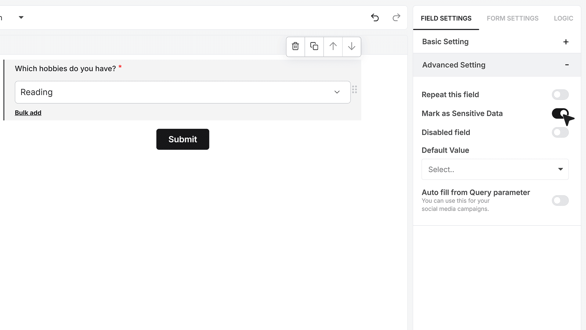
Mark as Sensitive Data is used when the field contains information that should not be visible to everyone on your team. When you enable this option, only team members with the right permissions in MakeForms will be able to view the selected values in the responses.
Default Value
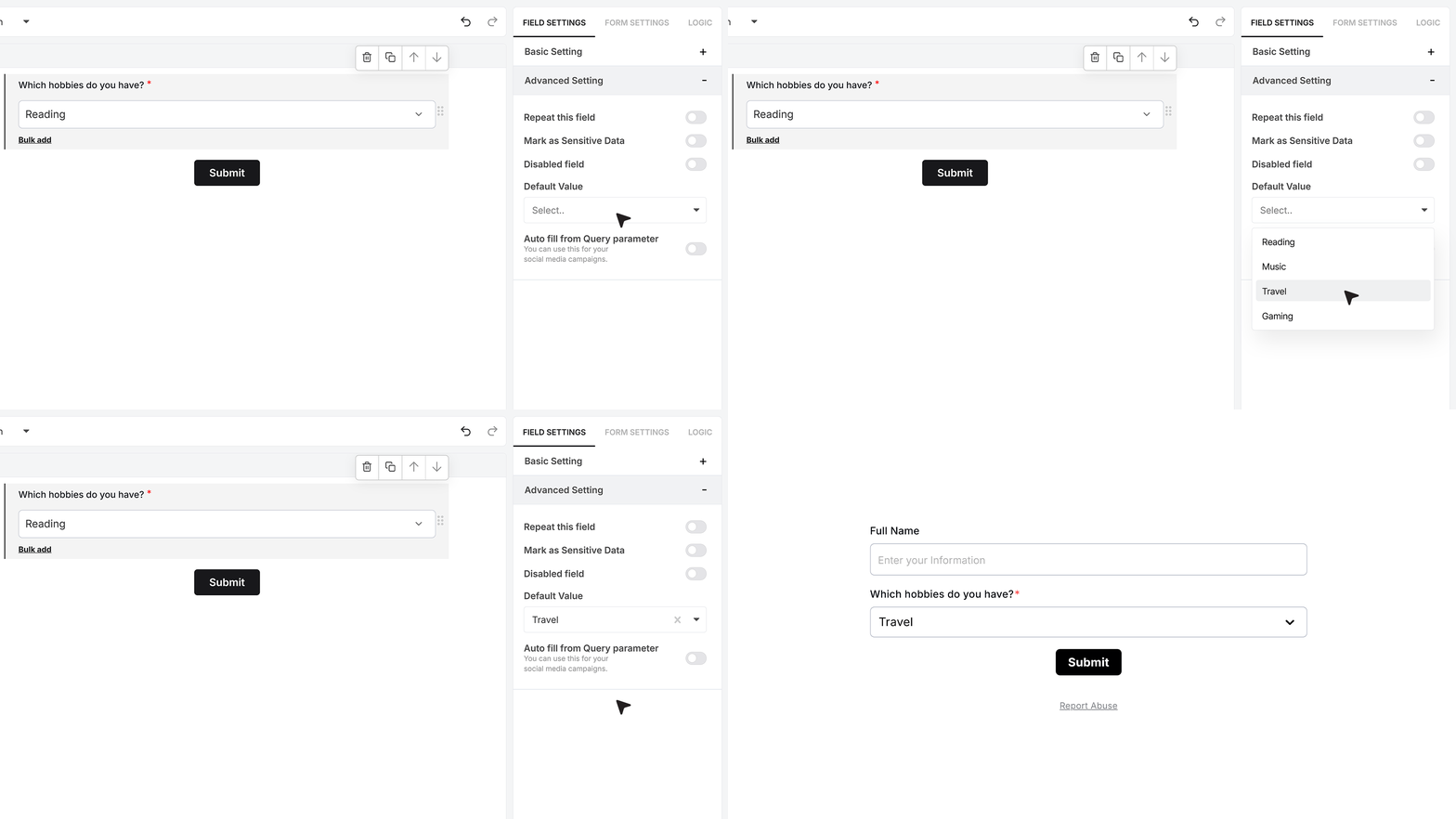
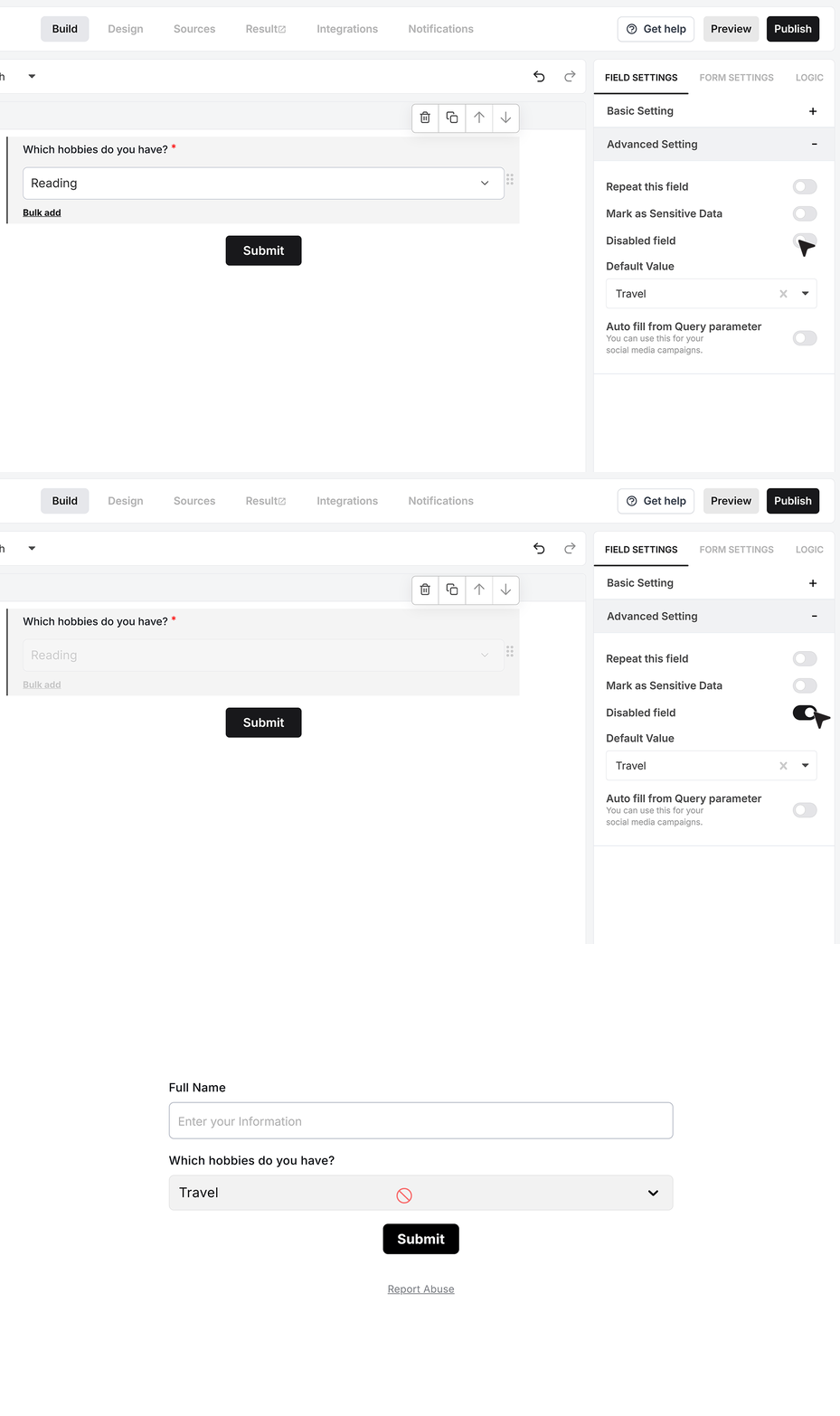
Default Value lets you decide which option should be pre-selected when the form loads. This is helpful when there is a common choice that most users pick. For example, if most people usually choose Travel from the hobbies list, you can set Travel as the default. The user will see it selected by default but can still change it unless the field is disabled.
Disable Field
Disable Field turns the dropdown into a read-only field. The user can see the value but cannot change it.
Autofill from Query Parameter
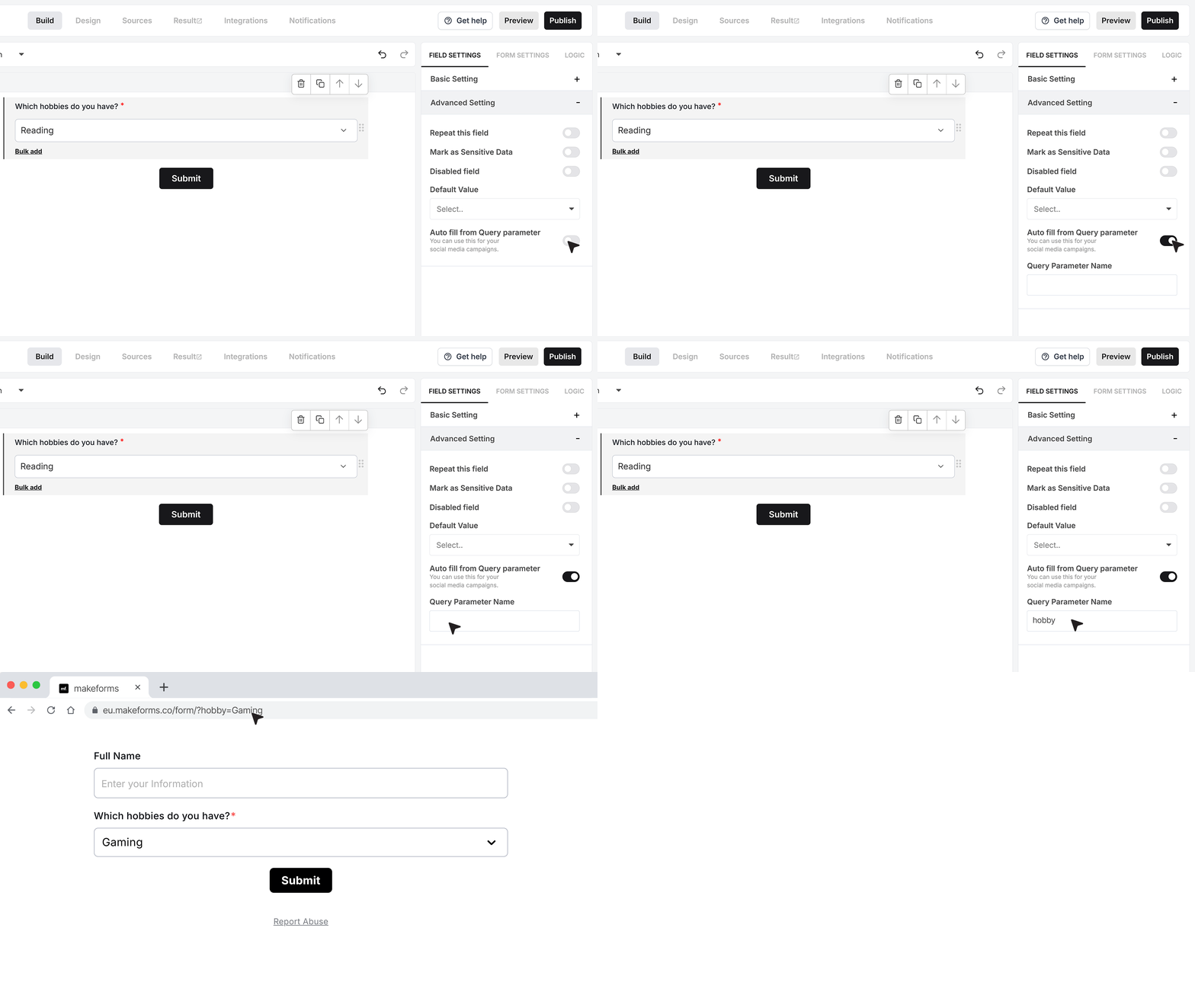
Fill from Query Parameter allows the dropdown to auto-select a value based on the page URL. In the field settings, you set a query parameter name, for example hobby. Then you can share a link such as ?hobby=Music. When someone opens the form with that link, MakeForms checks the value of hobby. If Music exists in the dropdown options, it will be selected automatically. This is useful for pre-filled links in emails, campaigns, or personalized flows.
Mark as Unique Field
When you enable Mark as Unique Field, the Text Area accepts only responses that haven’t been submitted before. This ensures every entry remains unique and prevents different users from entering the same text. If someone submits a duplicate value, the form displays an error message letting them know that the response has already been used..
FAQ's
If dropdowns are a key need, pick a builder that supports long option lists, required validation, helper text, built-in lists (like countries or time zones), multi-select, and prefill. MakeForms covers these basics well, it supports custom option lists plus built-in predefined lists, multi-select, “Other”, default value, and URL-based autofill for preselecting values.
Yes. In MakeForms you can add your own options in Custom Mode, keep the option order as entered, bulk add large lists, set placeholder text, and add helper text as either an icon tooltip or inline text.
Yes, many free plans across form tools include basic dropdown fields. The exact limits usually depend on plan rules like response caps, branding, and export or integration limits. (The provided MakeForms dropdown doc explains dropdown setup, not free plan limits.)
Yes. Most builders let you publish the form and embed it on your site using an embed code (commonly an iframe or a script embed). After embedding, test the dropdown on desktop and mobile, and verify it still enforces required validation and default values as expected. (Embedding steps are not shown in the provided dropdown doc.)
Look for tools that support “data source” driven options, like options loaded from an API, database table, or a connected sheet. In the provided MakeForms dropdown doc, the dropdown supports built-in predefined lists and custom lists, plus URL-based autofill that can auto-select a value if it matches an existing option, but direct database-linked option loading is not described here.
Use the field’s Default Value setting and select the option you want pre-selected when the form loads. Users can still change it unless the field is disabled.
Most modern builders do, but the key is the form renderer, not just the editor. You should verify the dropdown uses a mobile-ready control, supports scrolling long lists, and remains usable with multi-select and “Other” input. (Mobile behavior is not detailed in the provided dropdown doc.)
Tools that include response reporting usually let you view counts per option, filter by option, and export results for deeper reporting. The provided MakeForms dropdown doc focuses on field setup (options, default value, autofill, sensitivity), not analytics screens or reports.
Common ways are: conditional rules inside the form (show or hide fields based on the selected option), and external automation using integrations or webhooks that pass the selected value to other systems. The provided MakeForms dropdown doc shows URL-based autofill and field behavior settings, but it does not describe workflow triggers.
In MakeForms you can control user-facing text like Placeholder Text and Helper Text, including whether helper text shows as an icon tooltip or as text under the field. Deeper visual styling (colors, fonts, borders) depends on the builder’s theme or styling controls, and is not covered in the provided dropdown doc.