Slider Field
The Slider field allows users to select a numeric value by dragging a handle along a defined range. When emojis are enabled, the slider also displays a visual expression that changes based on the selected value. This makes the field useful for feedback, satisfaction scoring, and experience ratings.
Adding the Slider field
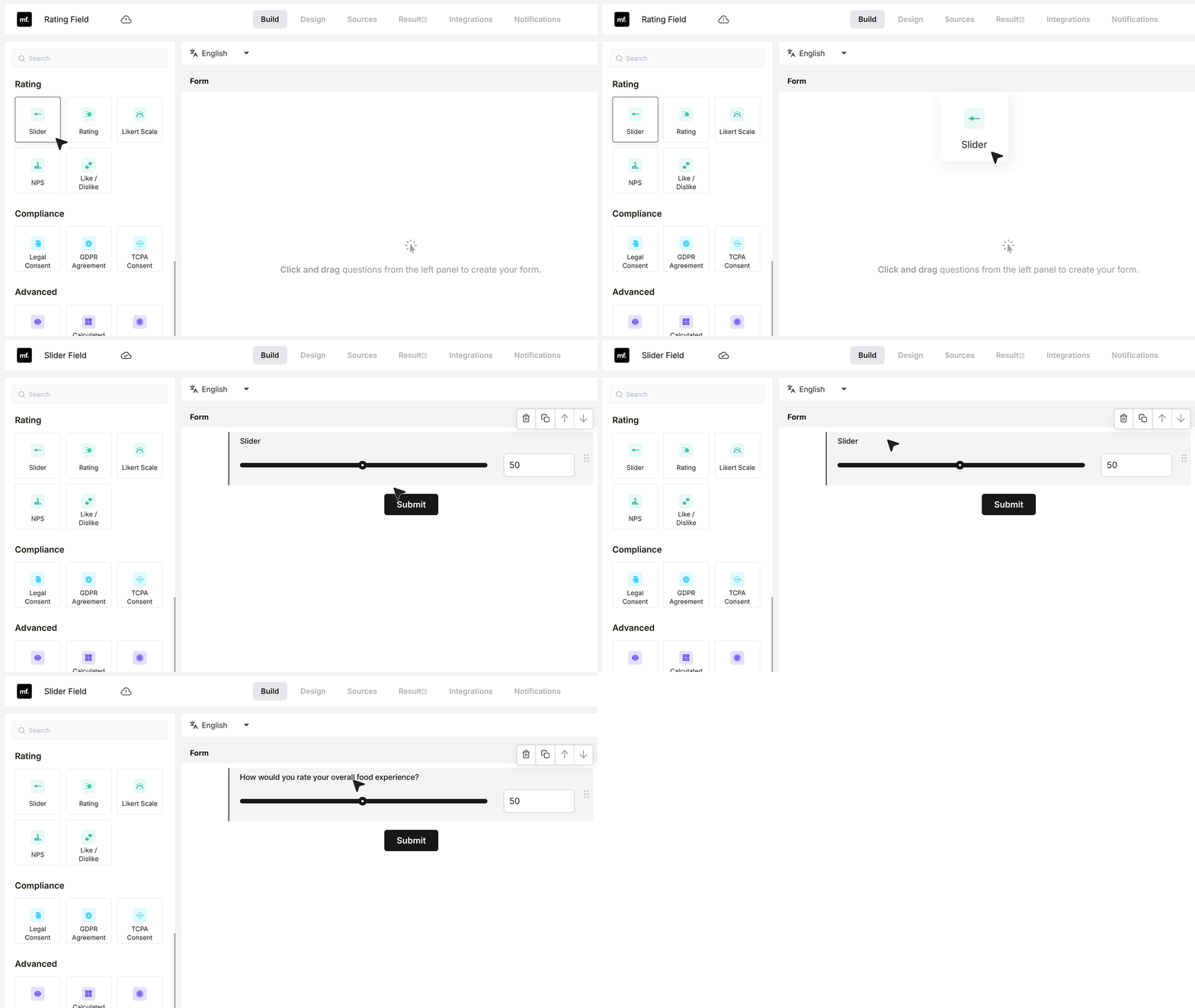
In the form builder, open the field list and drag the Slider field into your form. Click on the label and change it to match your form. For example, you can write “How would you rate your overall food experience?”
Once the field is added, you can start adjusting its settings.
Basic Settings
Required Field
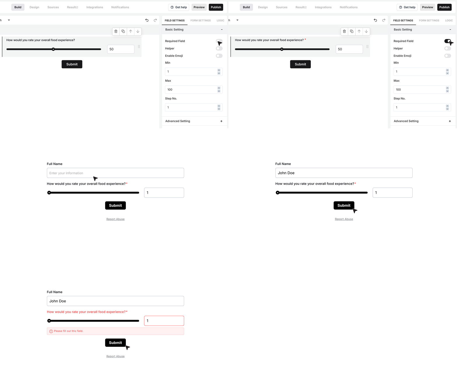
The Required Field toggle controls whether the user must pick a value on the slider before they can submit the form.
If this is turned on and someone tries to submit the form without choosing a value, MakeForms shows an error and stops the submission. They must select a value before the form goes through. Use this when the slider input is important for your form.
Helper text
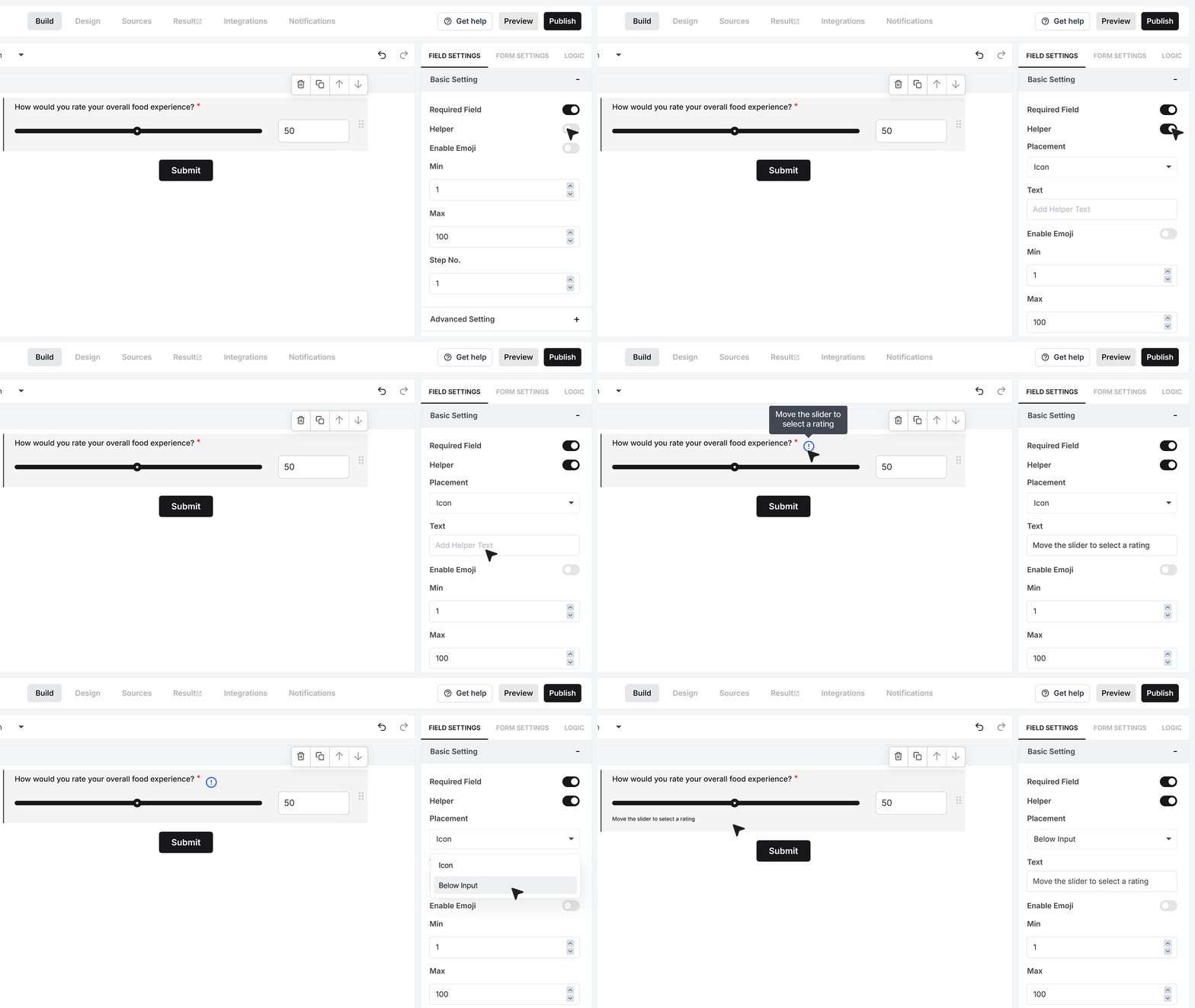
The Helper Text option is useful when you want to give extra guidance.
Turn it on and add a short note such as “Move the slider to select a rating.” This helps users understand what they are supposed to do with the slider.
You can show this text as a small info icon that reveals the message on hover, or as a visible line of text under the field. Choose the style that keeps your form clear and easy to read.
Enable Emoji
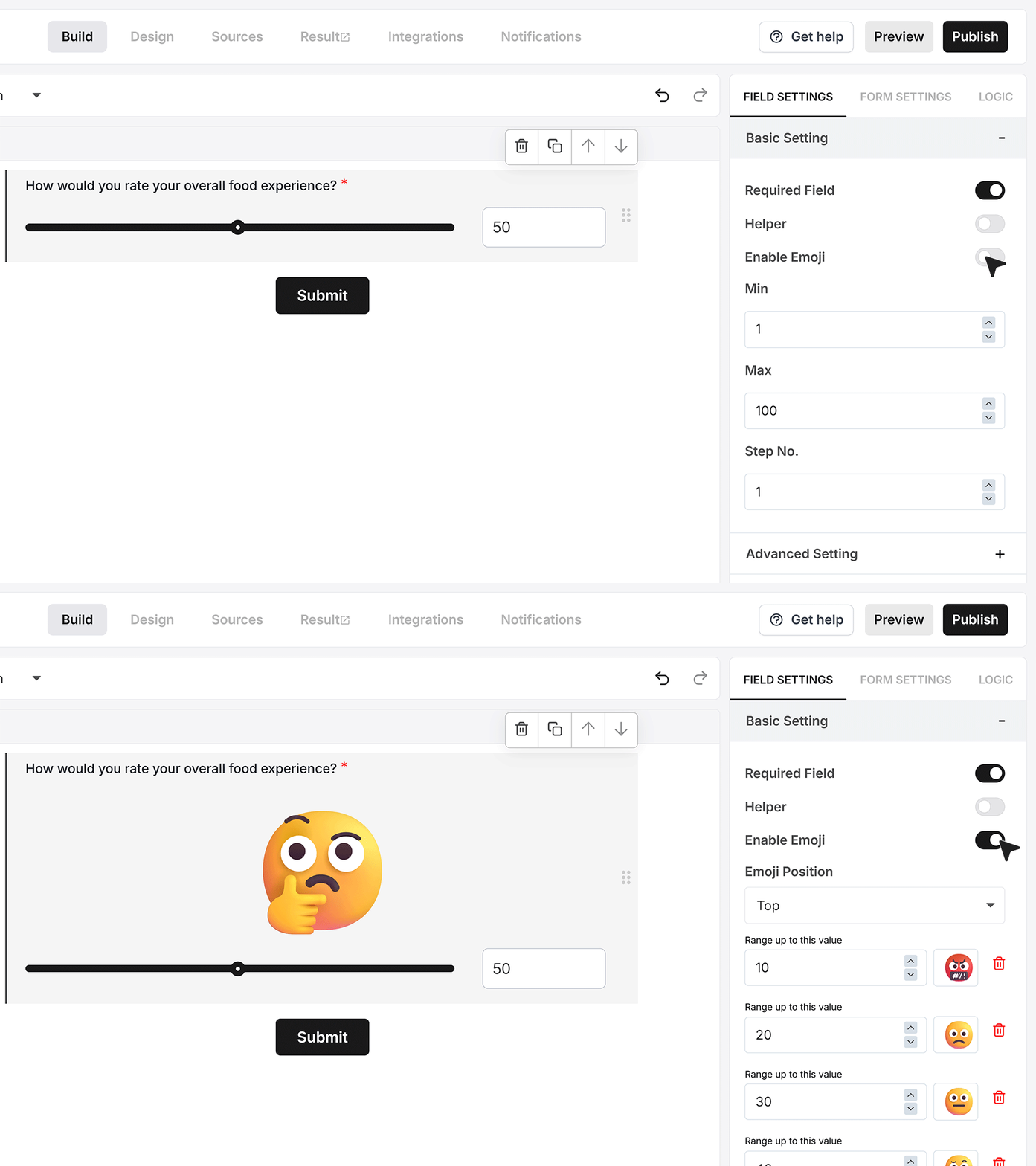
The Enable Emoji setting lets you show emojis that change with the slider value.
Turn this on to link emojis to the slider. As soon as you enable it, an emoji appears with the slider. When the user moves the handle, the emoji changes based on the current value.
The response still saves a normal number in your data, the emoji is only for display on the form.
Emoji Position
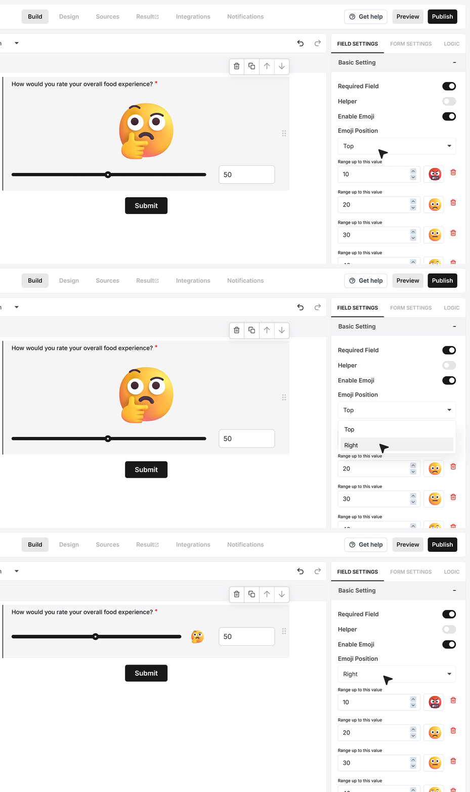
The Emoji Position setting controls where the emoji appears next to the slider.
You can place the emoji above the slider or to the right of it. Pick the position that looks better with your form layout and other fields..
Range for each emoji
- When emojis are enabled, you will see rows where you can set a value and pick an emoji for that range.
For example, you can use an angry face for low values, a thinking face for middle values, and a happy face for high values.
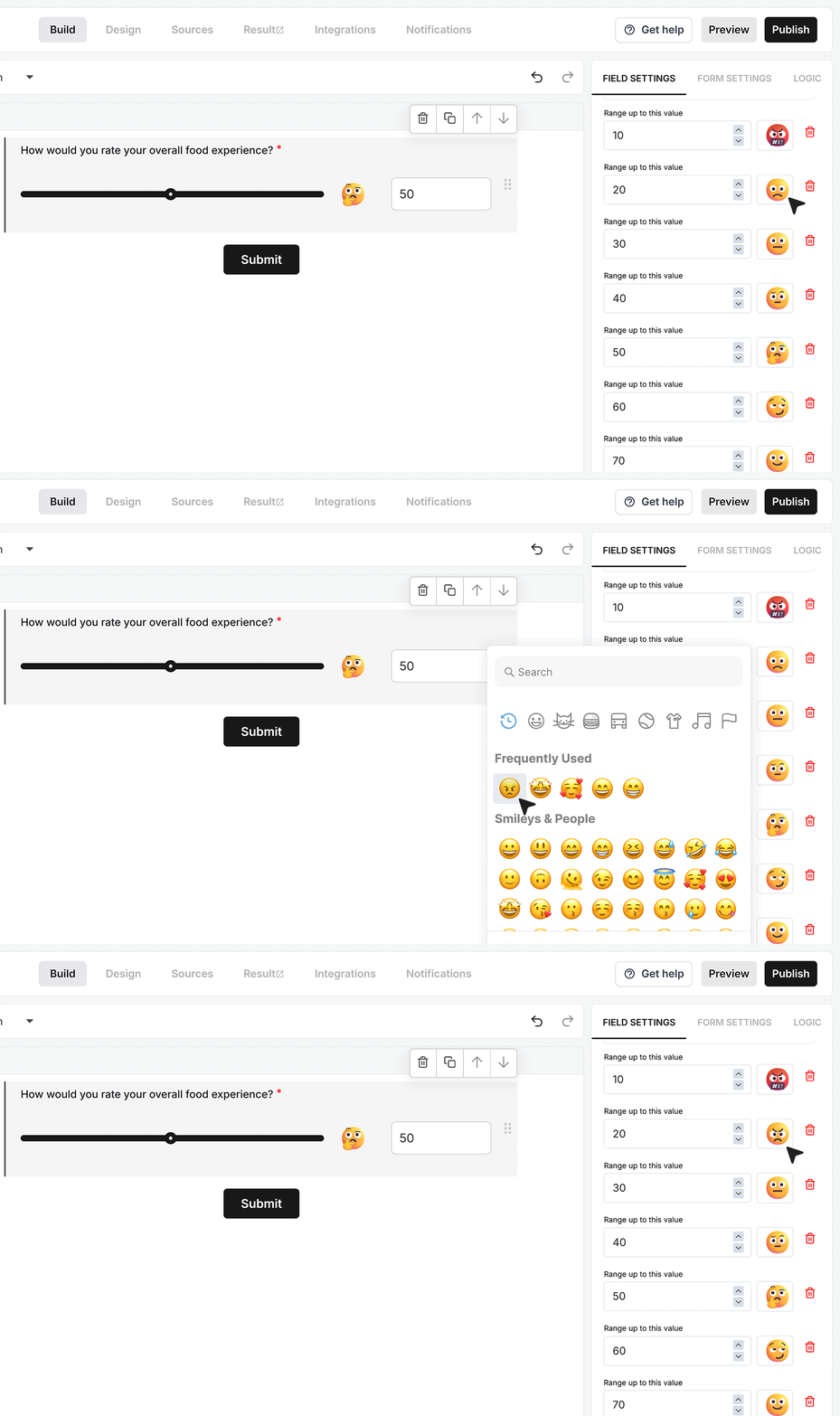
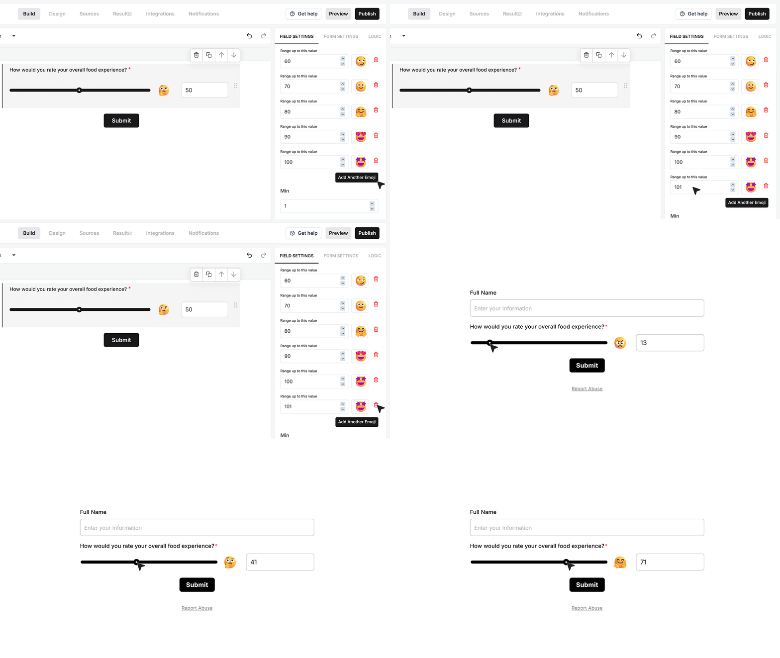
- You can add more rows if you need extra ranges, or delete rows you do not need. As the user moves the slider, the emoji changes whenever the value enters a different range.
Min, Max
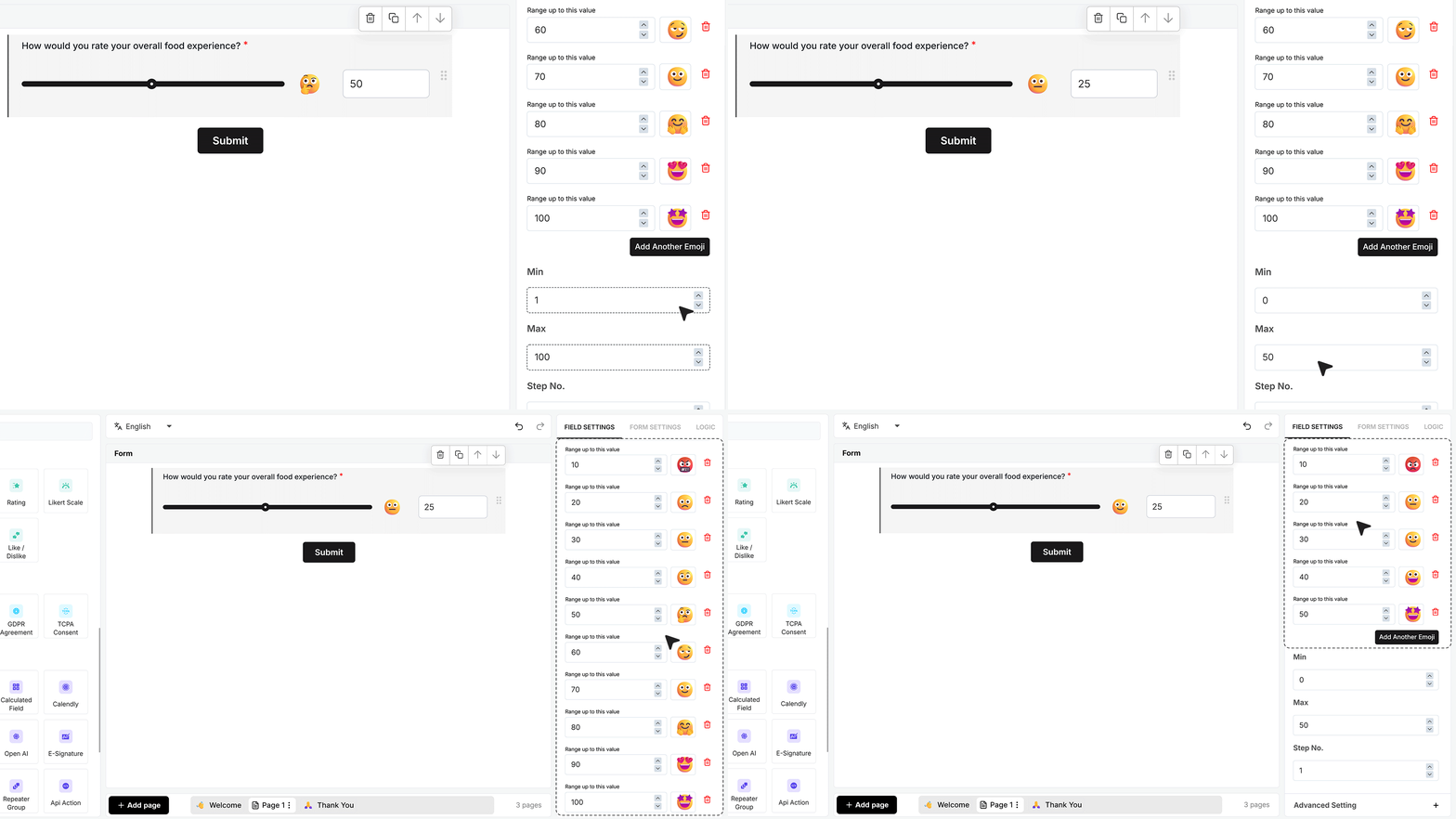
Minimum and Maximum control the lowest and highest number the user can pick. For example, you can set the slider from 1 to 100, from 0 to 50, or any other range that fits your use case. If you change the minimum or maximum, check your emoji ranges so they still match the new scale.
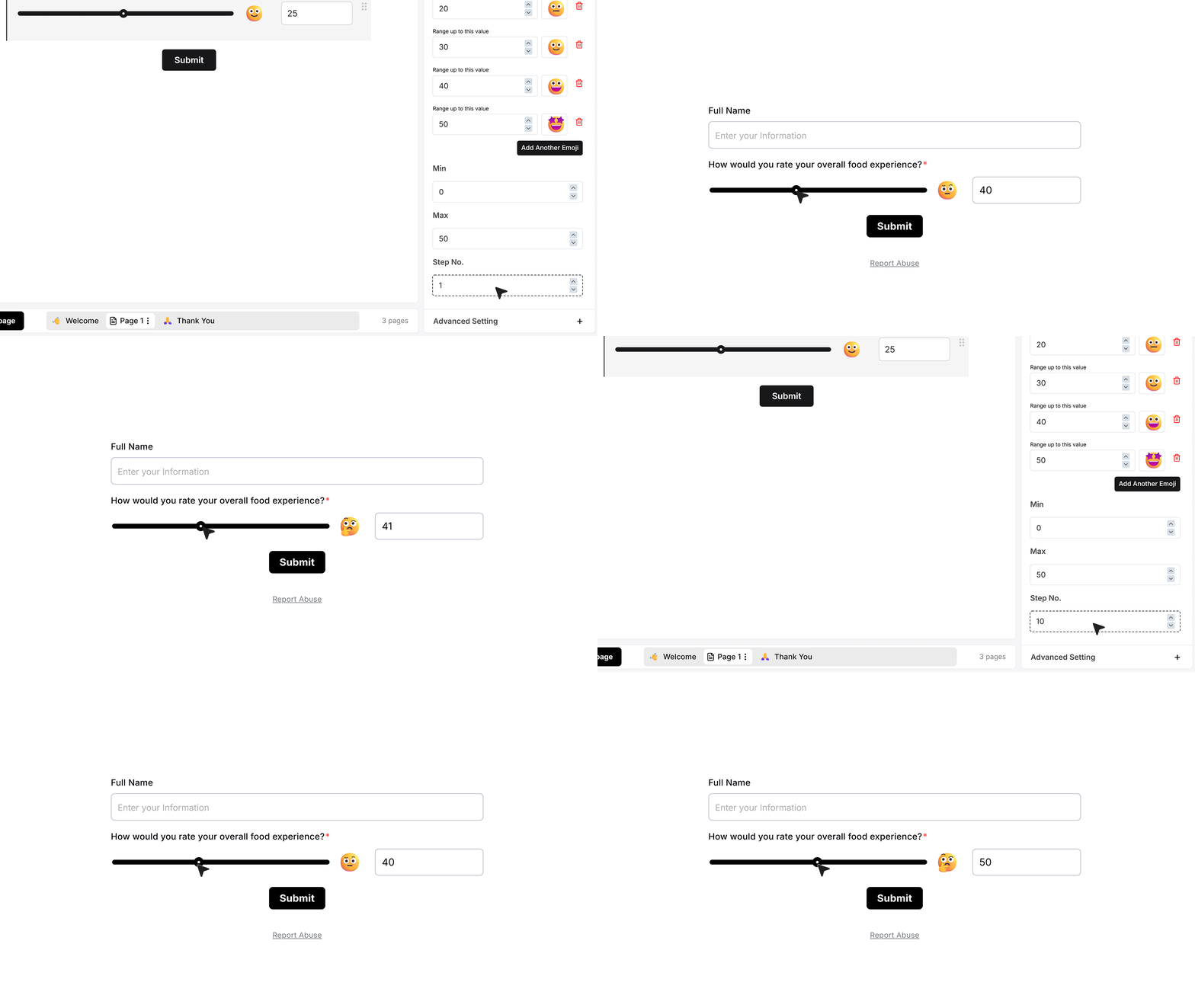
Step Number
Step controls how the slider moves between numbers.
A step of 1 means every number in the range is possible. A higher step, such as 10, means the slider jumps in larger steps like 0, 10, 20, 30, and so on.
Advanced Settings
Repeat This Field
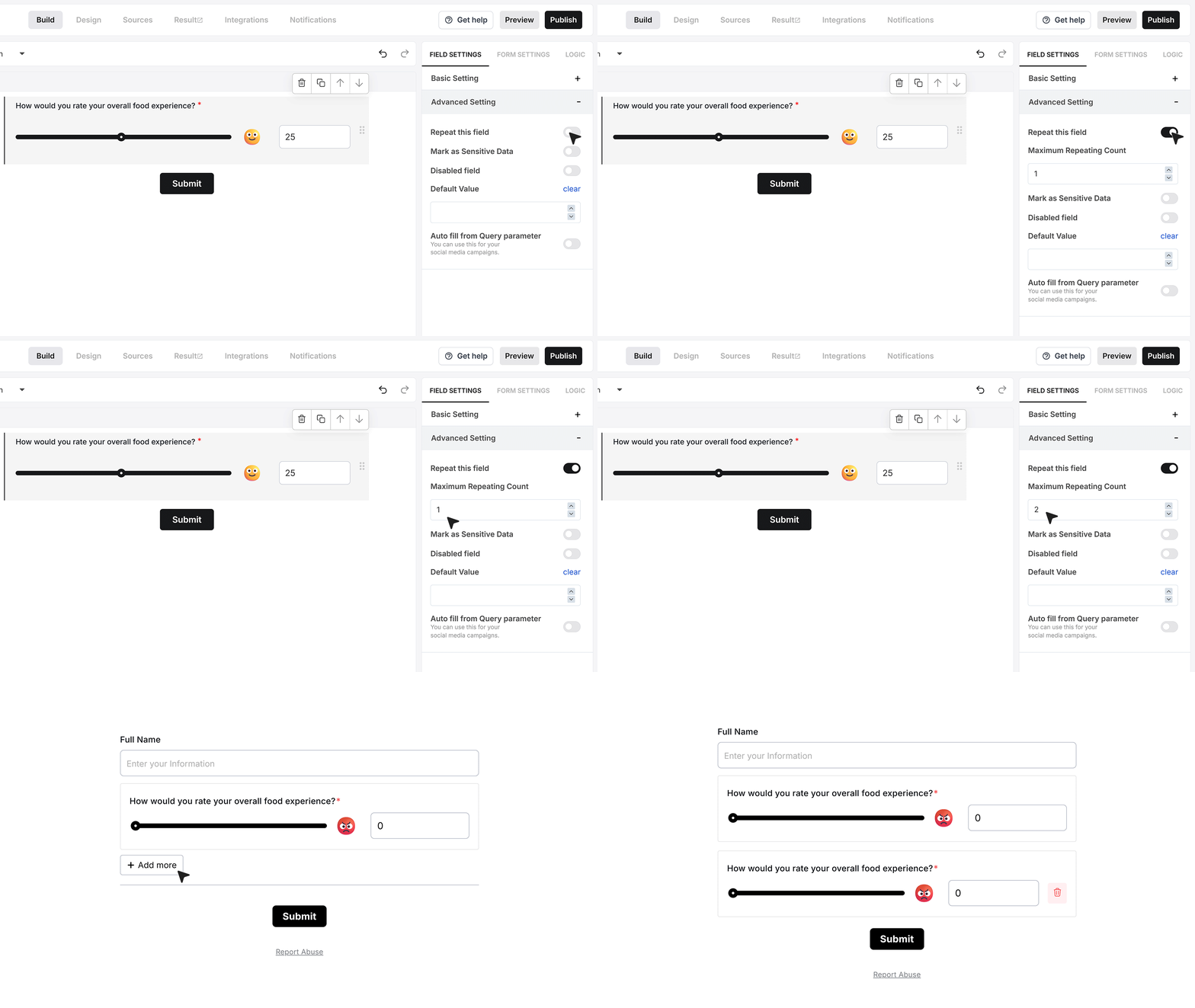
Repeat This Field lets users add more than one slider with the same setup.
Turn this on if you want to allow multiple sliders in a row.
When you enable it, you will see a box where you can set how many times the field can repeat. For example, if you set the limit to 2, the user will see one slider by default and an “Add more” option. They can click it once to add a second slider. This is useful when you want them to rate more than one thing in the same way.
Mark as Sensitive Data
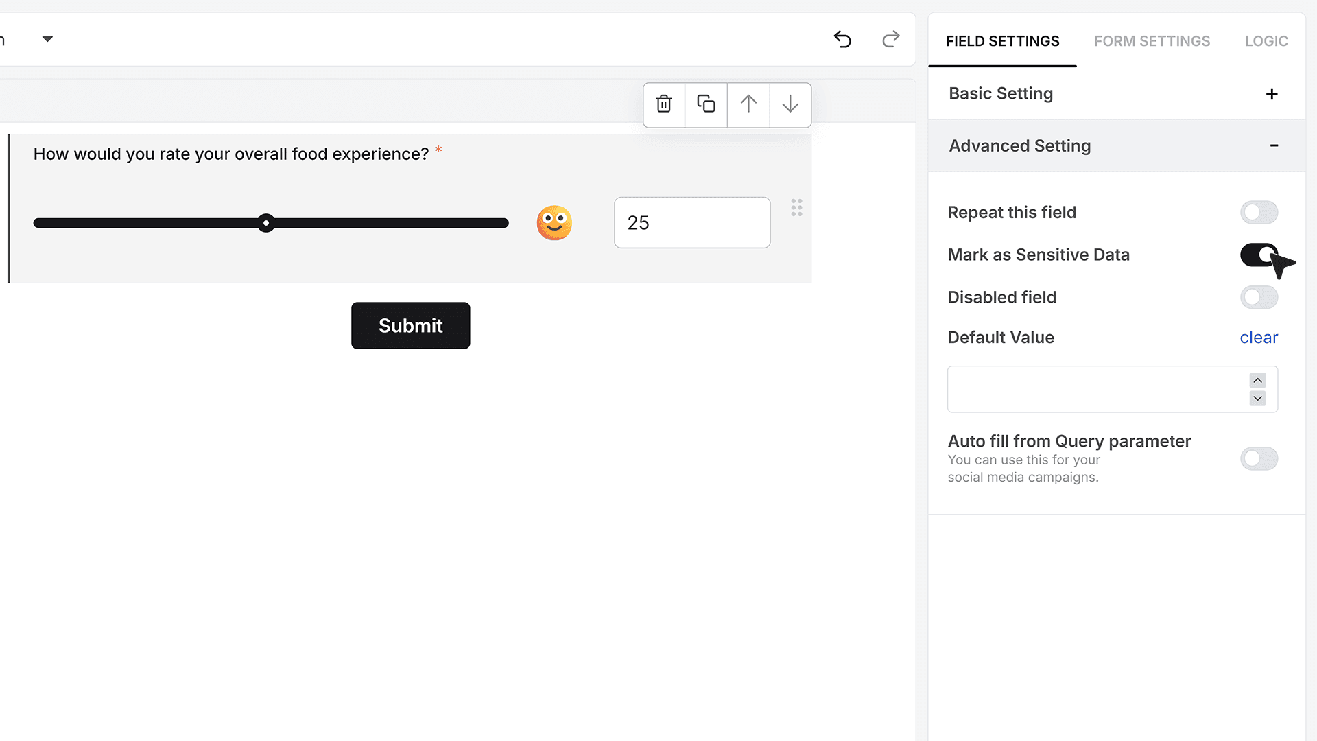
The Mark as Sensitive Data option controls who can see the slider values inside MakeForms.
Turn this on when the values should not be visible to every team member. When this setting is active, only users with the right access level can see the values in the Responses section.
Default Value
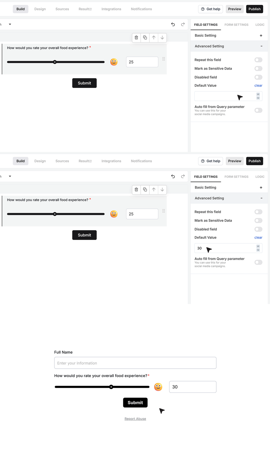
The Default Value setting lets you pre-fill the slider with a starting number.
You can set a value such as 30 when your range is 0 to 50. When the form opens, the slider handle is already placed at that value and the matching emoji shows. The respondent can still change it before submitting, as long as the field is not disabled.
Disable Field
The Disable Field option turns the Slider into a read-only field.
When this is enabled, users can see the slider and the value, but cannot move the handle. This is useful when the value comes from another system and you only want to display it on the form.
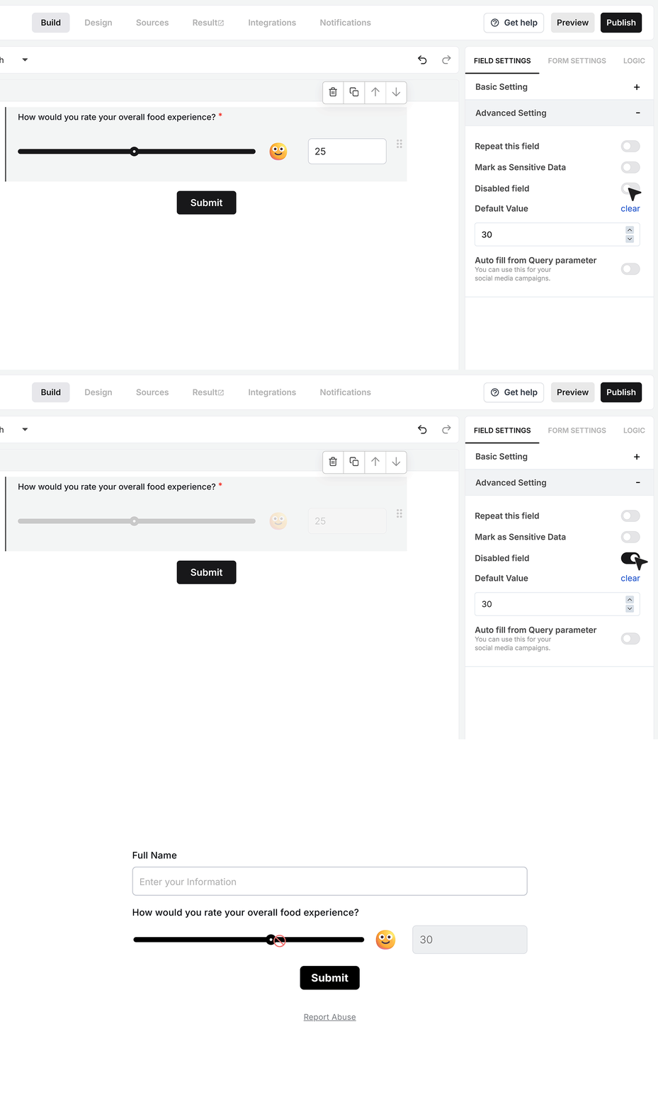
Autofill from Query Parameter
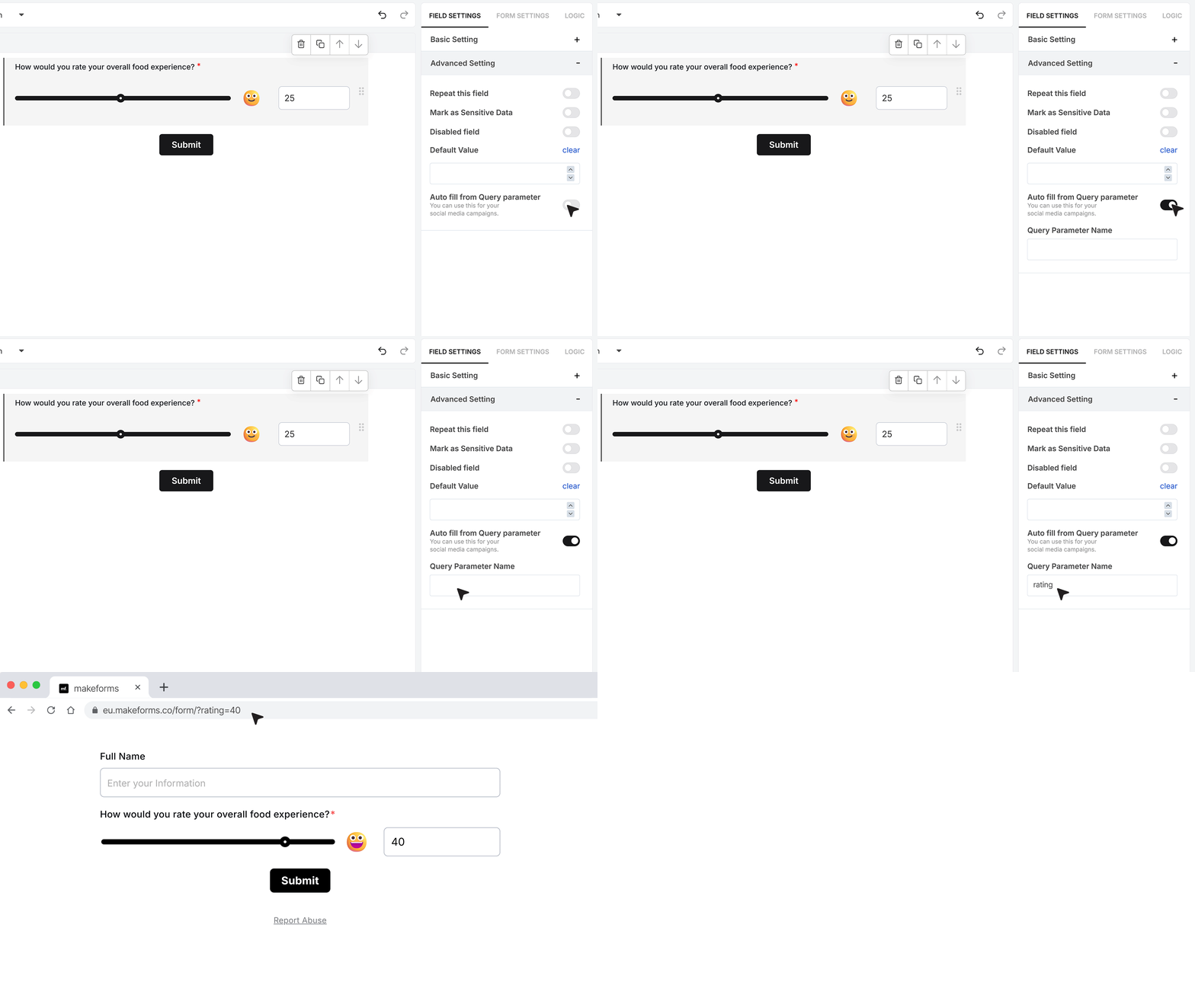
The Autofill from Query Parameter setting links the Slider field to a value in the form URL.
To use this, enter a parameter name, for example rating. When you share the form link, add that parameter with a value inside the slider range. If the range is 0 to 50, you can share a link like ?rating=40.
When someone opens the form with this URL, the Slider reads that value and fills it in, as long as it is valid for the current range. The emoji will also update based on that value.
FAQ's
A slider field is an input type that lets users select a value by moving a handle across a range. Instead of typing or choosing from options, users can quickly pick a number or level by sliding left or right.
This is commonly used for ratings, budgets, satisfaction levels, or any input that fits within a defined range.
Use a slider field when you want users to:
- give a quick rating
- choose a value within a range
- respond without typing
Slider fields work best for simple inputs like feedback scores, experience levels, or pricing ranges. They reduce effort and help users complete forms faster.
A slider field improves form experience in a few key ways:
- faster input compared to typing
- more engaging and interactive
- reduces form fatigue
- helps users answer without overthinking
This supports better completion rates because forms feel easier to fill.
Slider fields work well for:
- rating questions like satisfaction or experience
- budget or price range selection
- intensity-based responses like “how likely” or “how often”
- feedback scores like NPS
They are not ideal for exact values where precision is critical.
Yes. You can define a fixed range by setting minimum and maximum values. This ensures users only select values within a valid limit.
This helps maintain clean and structured data from the start.
Yes. You can control how the slider moves by setting step values.
For example:
- step of 1 for precise control
- step of 10 for broader ranges
This helps match the slider behavior to your use case.
Yes. Slider fields work well on mobile because users can interact with them using touch.
Since most forms are completed on mobile, interactive fields like sliders help make forms easier to complete.
Yes. Slider values can trigger conditional logic.
For example:
- show follow-up questions if value is above a threshold
- skip sections based on user input
This helps create smarter forms that adapt to user responses.
In many cases, yes.
Slider fields reduce typing effort and make forms feel quicker to complete. When forms feel easier, users are more likely to finish them.
Yes. You can add labels to explain what the values mean.
For example:
- 1 = Very Unsatisfied
- 10 = Very Satisfied
This helps users understand the scale and give more accurate responses.
Not always.
Slider fields are better for approximate or range-based answers. If you need exact numbers, a number input field is more suitable.
Yes. You can mark the slider field as required so users must select a value before submitting the form.
This ensures no missing data in your responses.
Slider fields simplify decision-making.
Instead of typing or choosing from many options, users can quickly slide to a value. This keeps the form flow smooth and reduces drop-offs.
Yes. Slider fields are ideal for feedback forms.
They are commonly used for:
- satisfaction ratings
- product feedback
- service experience scores
They make feedback collection faster and more intuitive.
A slider field:
- is visual and interactive
- best for ranges and quick input
A number field:
- is precise and typed
- best for exact values
Use sliders for experience, not precision.