Input Field
The Input Field in MakeForms is designed for collecting plain text from your users, such as employee IDs, project codes, reference numbers, or any general text-based information. It accepts typed input exactly as entered and gives you full control over formatting, structure, and validation
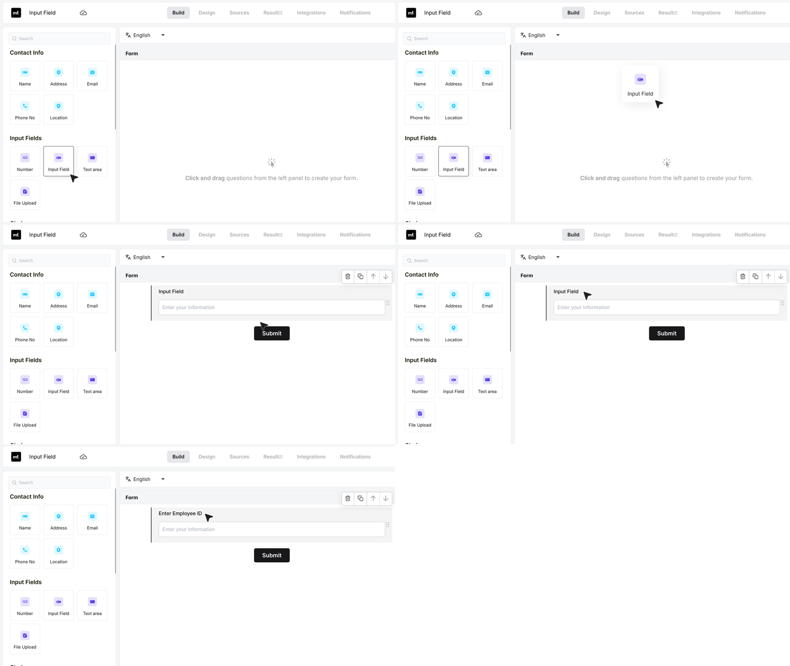
To begin using it, add an Input Field to your form and update the field label so users clearly understand what to type—for example, Enter Employee ID or Enter Project Code.
Basic Settings
Required Field
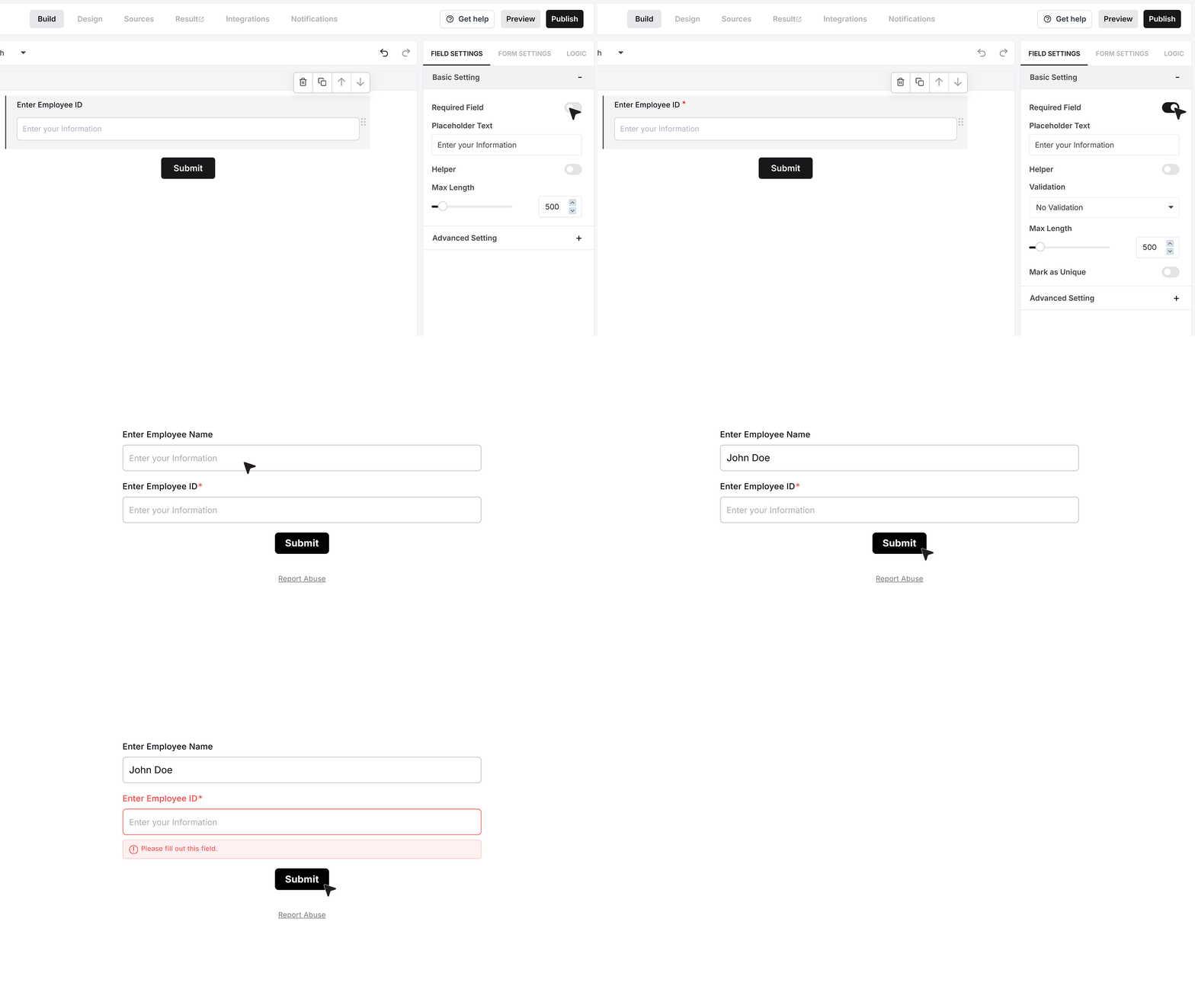
The Required Field option appears at the top of the settings panel. When enabled, the user must enter a valid value before the form can be submitted. If the field is left empty, the form displays an error and prevents submission until the text is provided.
Placeholder Text
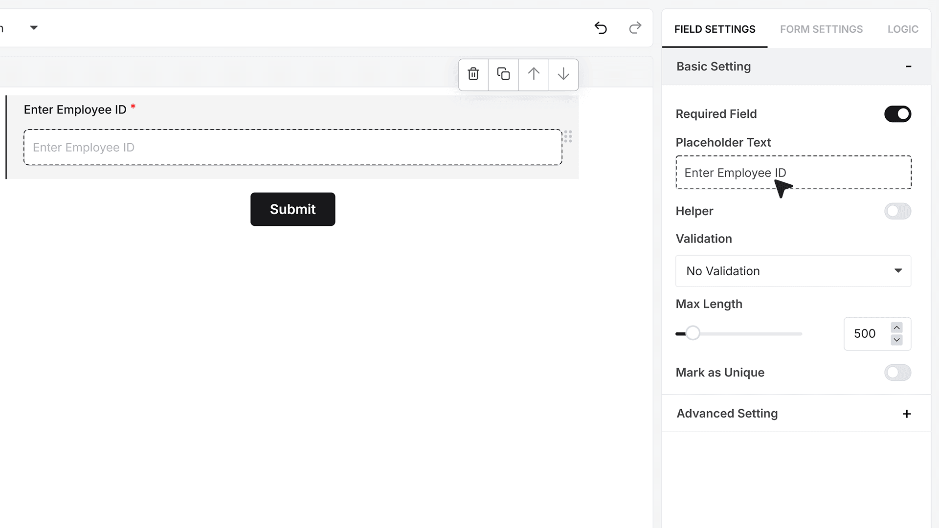
Placeholder Text appears inside the field before the user begins typing, helping guide what should be entered. Examples like “Enter Employee ID” or “Enter Promo Code” help set expectations and reduce confusion
Helper Text
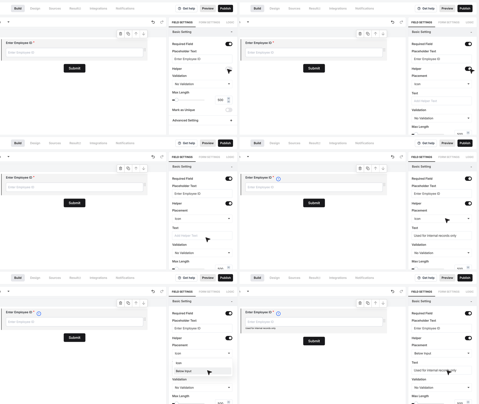
Helper Text gives you a small description under the field or inside an info icon. This can be used to share additional instructions or context without cluttering the layout, such as “Used for internal reference only” or “Follow the code format provided by your manager.”
Validation
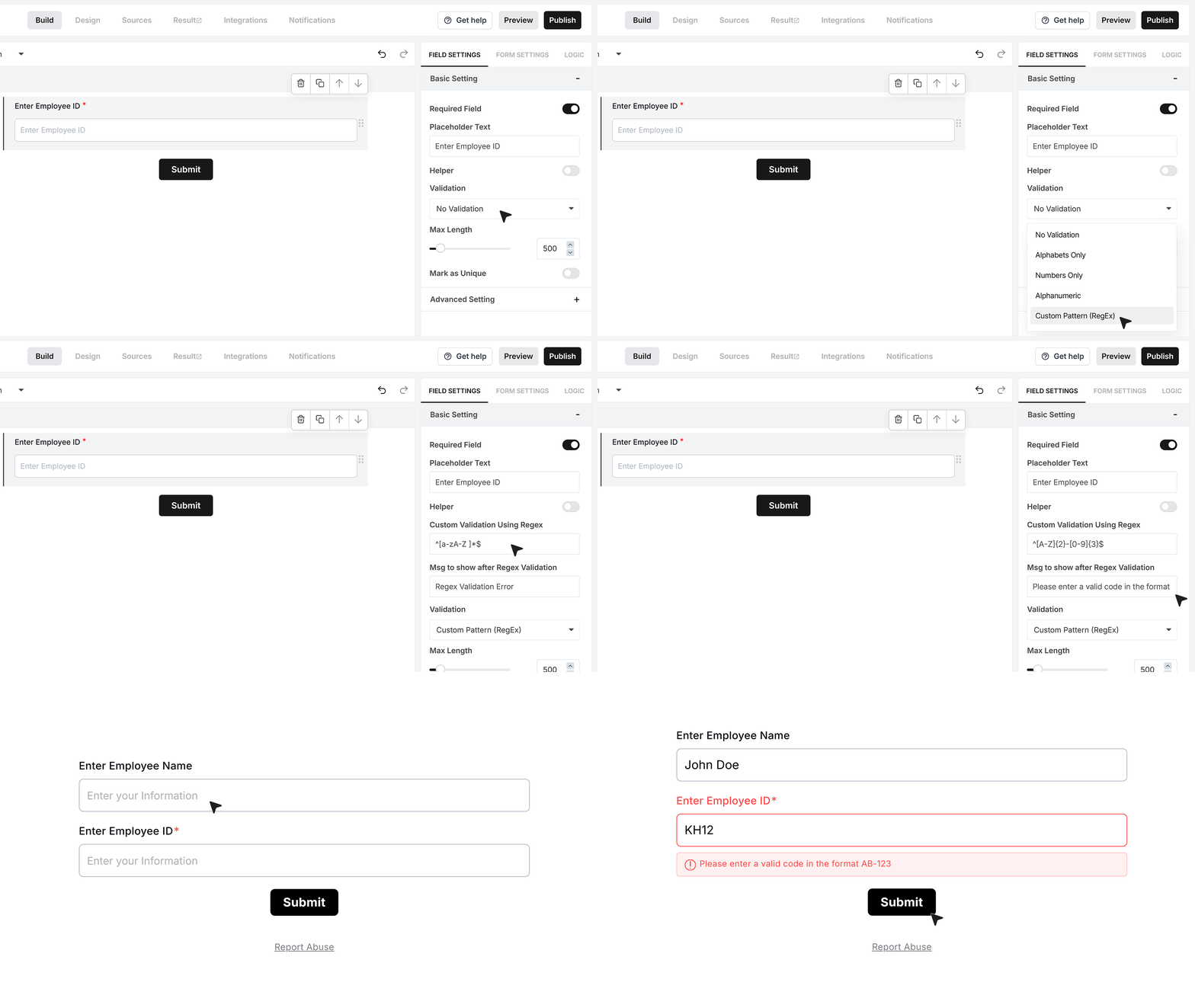
Validation Rules allow you to control what type of text is accepted. You can keep the input simple with alphabetic, numeric, or alphanumeric values. For structured formats, the Custom Pattern option lets you define a regex—for example, a pattern like ^[A-Z]{2}-[0-9]{3}$ ensures inputs follow a format such as AB-123 and blocks anything outside this structure. A custom error message helps guide the user if they enter an invalid value.
Maximum Length
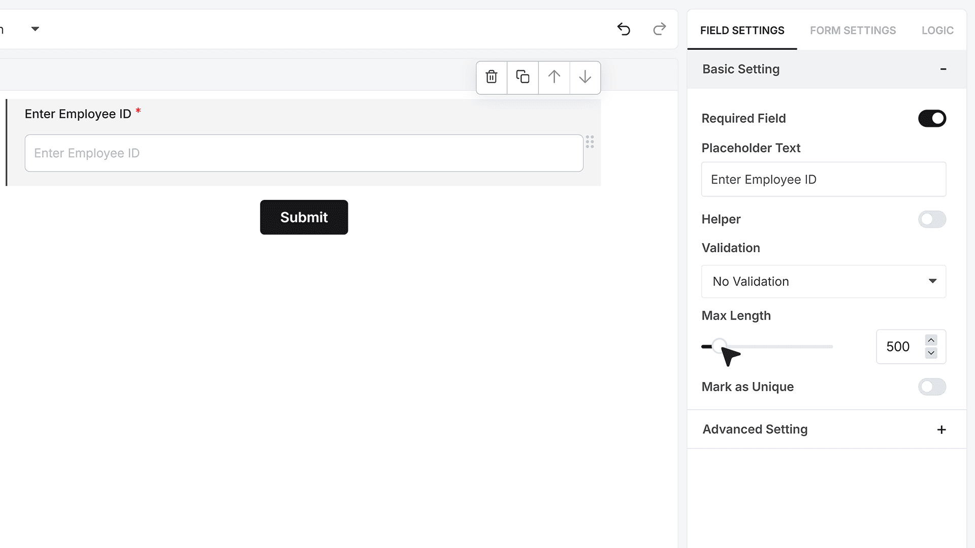
Maximum Length controls how many characters the user can type. This is especially useful when collecting fixed-length codes, short identifiers, or limited character entries.
Mark as Unique Field
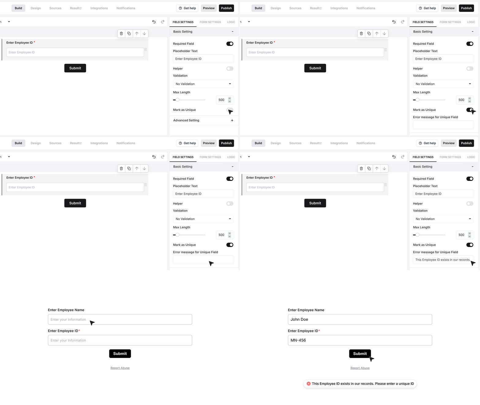
When Required is enabled, you can also mark the field as a Unique Field. This ensures each submitted value is different across all responses. It is ideal when collecting employee codes, voucher numbers, or any data that must remain unique. If a duplicate is found, the form displays a custom error message.
Advanced Settings
Repeat This Field
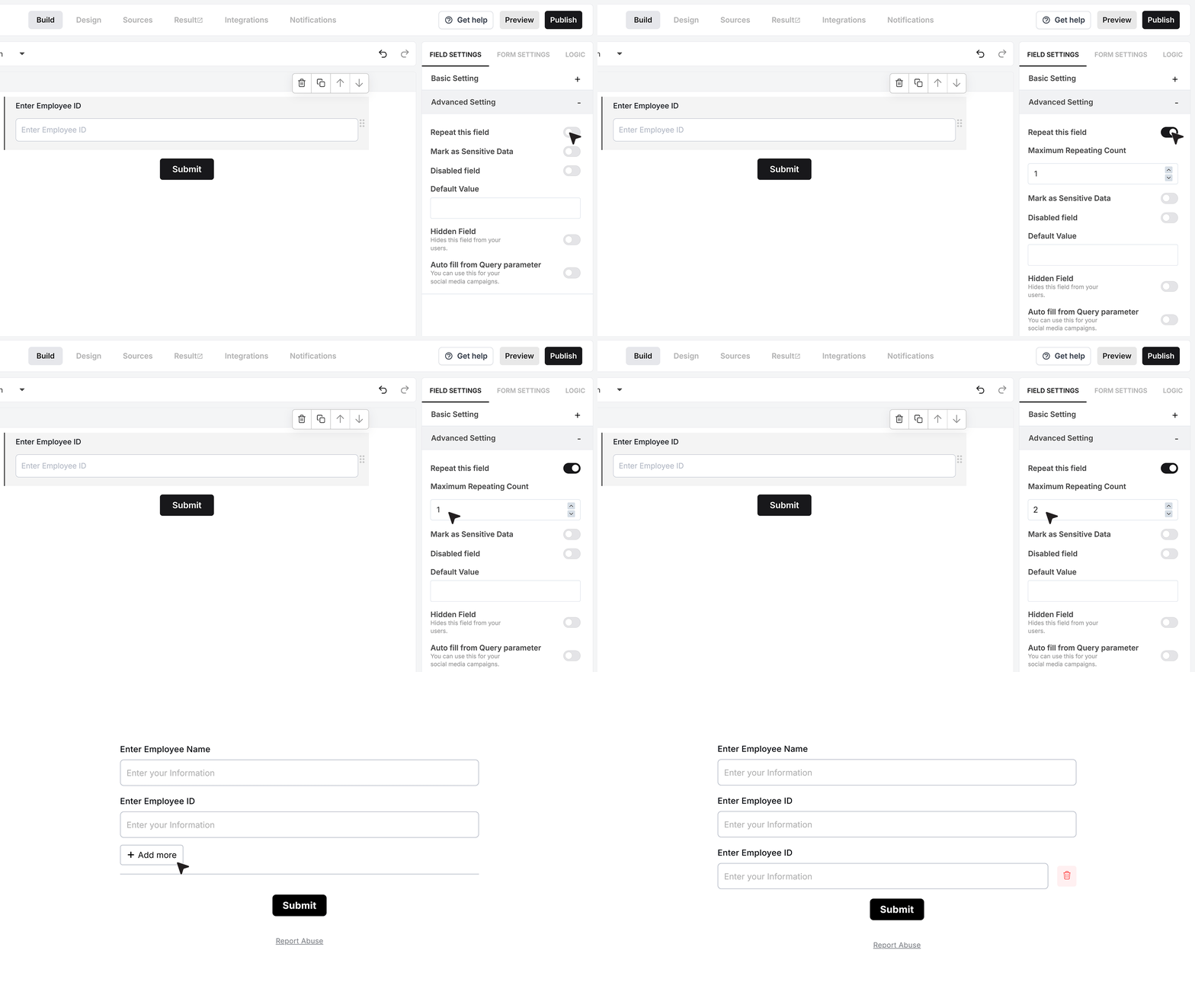
Repeat This Field allows users to submit multiple values within the same field group. When activated, users can click an “Add More” button to create additional text entries, making it easy to collect lists such as multiple IDs or reference numbers.
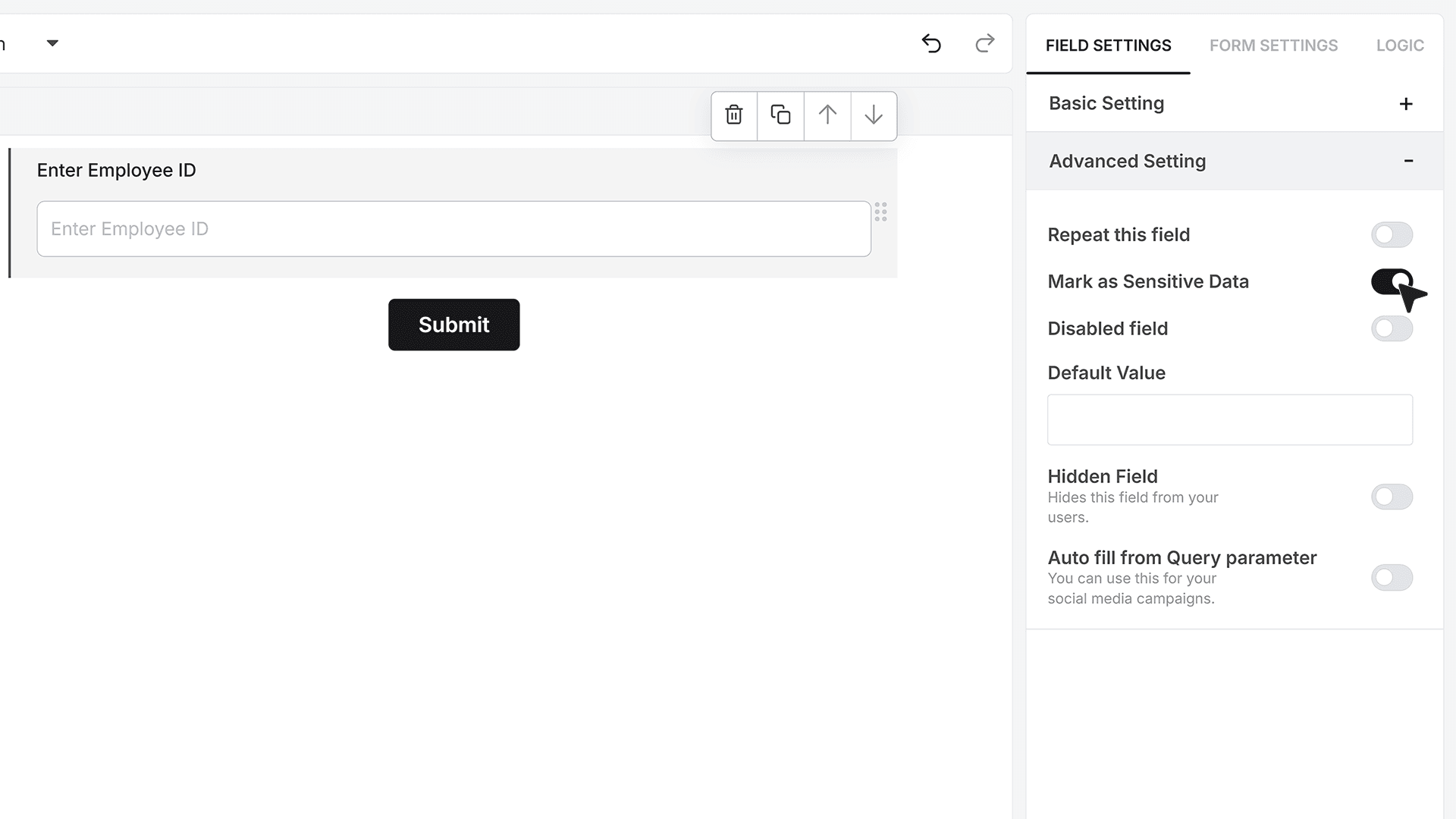
Mark as Sensitive Data
Mark as Sensitive Data hides the field’s value inside the Responses section from general team members. Only authorized users can access it, making this setting useful for confidential text, private internal references, or sensitive identifiers.
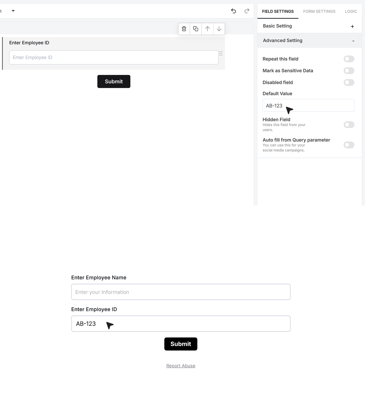
Default Value
Default Value lets you pre-fill the field when the form loads, which helps when displaying standard codes, known internal values, or pre-generated text for users to review.
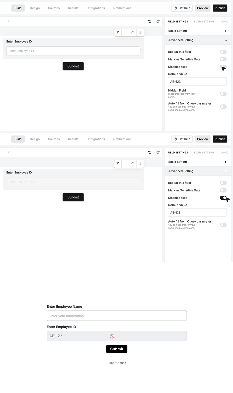
Disable Field
Disable Field keeps the value visible but prevents edits. This is useful when showing fixed identifiers, auto-generated codes, or read-only information that should not be modified.
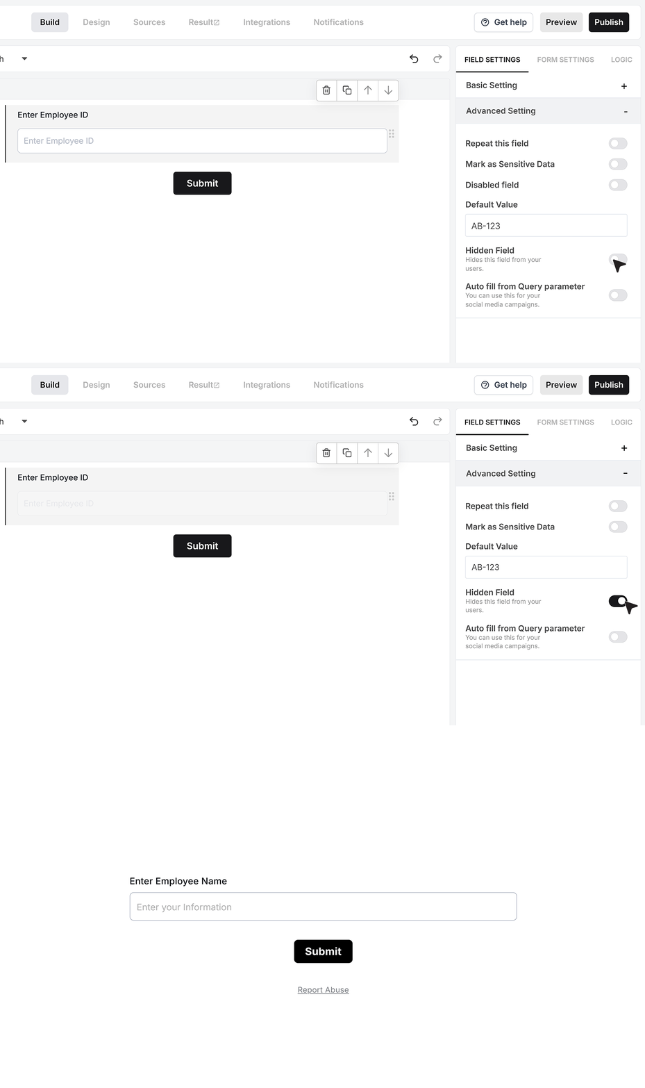
Hidden Field
Hidden Field removes the input entirely from the visible form while still including its value in the submitted response. This is commonly used for storing invisible metadata or internal reference values.
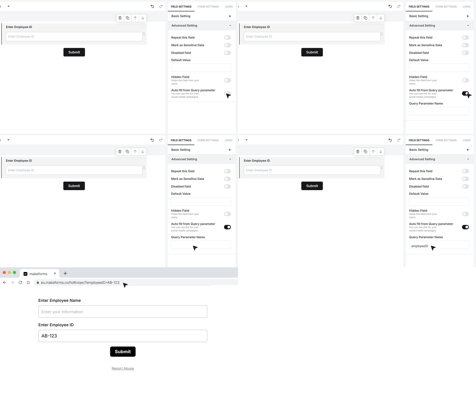
Autofill from Query Parameter
The Fill from Query Parameter option allows the Input Field to automatically populate using a value passed through the form URL. For example, if your key is “employeeID” and you open the form with ?employeeID=AB-123, the Input Field will instantly fill with “AB-123.”.
FAQ's
In MakeForms, open your form in the editor, then drag the Input Field into the form. After you add it, set the field label so users know what to type, for example “Enter Employee ID” or “Enter Project Code”
It depends on what “flexible” means for your use case, styling, validation, autofill, uniqueness, hidden values, repeatable inputs, and data access controls. In MakeForms, the Input Field supports required input, placeholder text, helper text, validation rules including regex patterns, max length, uniqueness across responses, repeat entries in the same field group, and query-parameter autofill. For comparisons, teams often look at MakeForms, Typeform, Jotform, Formstack, and Paperform, then pick based on the exact controls they need.
Yes. Most form builders support conditional logic, where you show, hide, skip, or require fields based on earlier answers. In MakeForms, you can use the Input Field value along with other fields to drive these rules (the exact options depend on your plan and the logic rules you set in the editor).
MakeForms supports validation rules on the Input Field, including alphabetic, numeric, alphanumeric, and a Custom Pattern option where you can apply a regex. Example regex shown in the doc is ^[A-Z]{2}-[0-9]{3}$ to enforce a format like AB-123. Other tools that commonly support validation rules include Jotform, Formstack, Paperform, and Cognito Forms.
In MakeForms, create multiple steps by splitting the form into pages or sections, then place Input Fields inside each step. Add next and back navigation, then test the flow in preview to confirm required fields and validation behave correctly on each step.
Yes. Many form builders support payments through payment fields or payment blocks (often via Stripe, sometimes PayPal depending on the tool). In MakeForms, payments are set up at the form level using payment features, then you place the payment field where you want it in the flow.
In MakeForms, submissions are available in the Responses area. You typically export the submission data to CSV or download it, or send it to another system using integrations or webhooks, depending on your workflow.
In MakeForms, map each Input Field to a CRM property using native integrations (if available), or use a webhook, Zapier, or Make to push submissions into your CRM. For stricter control, send the submission payload to your own API and write into the CRM from your backend.
In MakeForms, fonts and colors are controlled through the form design and theme settings, so the Input Field follows the styles you set for the form. If you need deeper control, use custom styling options available in your plan and embed method.
MakeForms supports prefill in two direct ways for the Input Field. You can set a Default Value so the field loads with a starting value, and you can auto-fill from a query parameter so the field populates from the form URL, for example?employeeID=AB-123. If you want the value visible but not editable, enable Disable Field. If you want it not visible but still submitted, use Hidden Field.
MakeForms is a strong option for advanced Input Field controls like regex validation, uniqueness, repeat entries, sensitive-data access control, and query-parameter autofill. Other well-known options include Typeform, Jotform, Formstack, Paperform, and Cognito Forms.
Free plans usually limit one or more of these: advanced validation (like regex patterns), conditional logic, integrations and webhooks, exports, custom branding removal, and team controls. In MakeForms specifically, advanced controls like Custom Pattern validation, uniqueness, and sensitive-data restrictions are the types of features that are commonly plan-gated in many products, so you should confirm what your current MakeForms plan includes.